Light Mobile App is a finance tracking tool designed to bring clarity and calm to personal money management. I delivered a full interactive prototype, cohesive branding, and a user-friendly interface—from initial research to polished design.
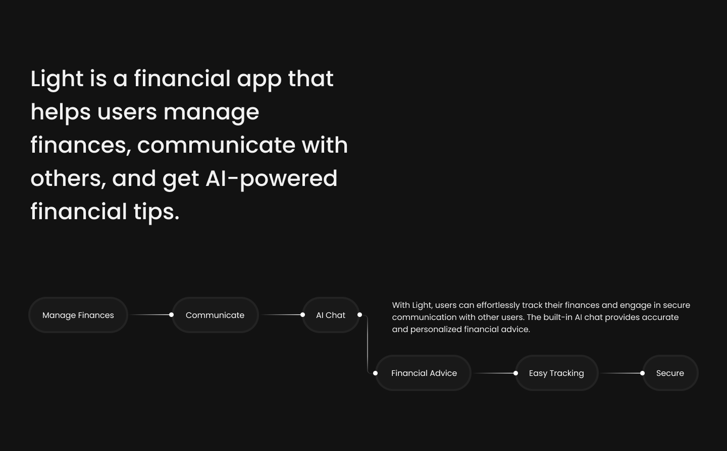
In a digital landscape cluttered with finance apps, Light aimed to be different—a beacon of simplicity and clarity for users seeking better financial awareness. Our mission: transform rough wireframes into a refined, functional, and engaging mobile experience that not only looked beautiful but felt intuitive.
Through a structured design process and rapid iteration, we delivered a polished interactive prototype, a brand identity, and a visual system that exceeded client expectations—setting the stage for scalable development and a compelling investor story.
The project kicked off with a strategic deep dive into the client's vision. Our goals were to understand:
We collaborated closely with product managers, engineers, and marketing leads to align on user goals and business objectives.
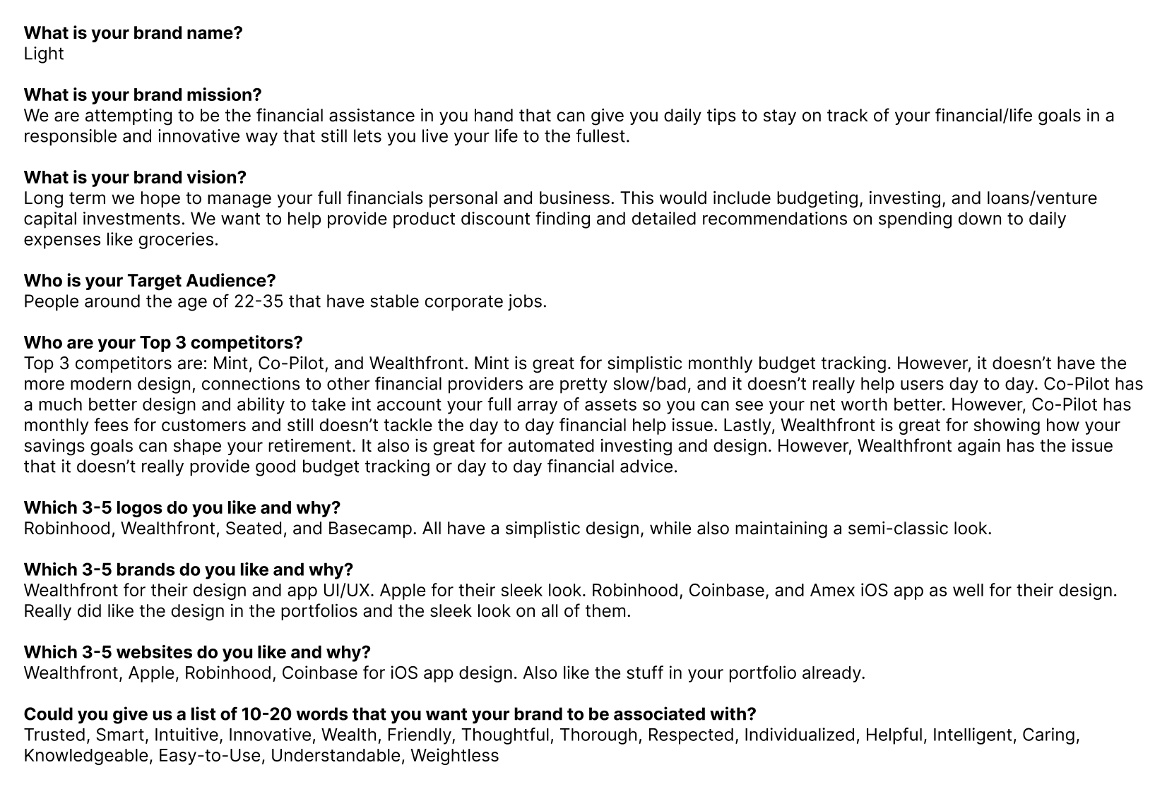
To align the team and uncover insights beyond the brief, we conducted in-depth interviews with:
These interviews revealed crucial themes:
Designing a fintech app isn’t just about clean interfaces or smooth transitions—it’s about understanding the emotional and practical journey of users as they navigate their finances. For Light, we approached this with one goal in mind: create a tool that doesn’t just function, but empathizes.
We didn’t jump straight into screens. First, we mapped the journey.
Before we could redesign or improve anything, we needed to step into the users' shoes. What do they think, feel, and do when they discover the app, decide to sign up, and eventually manage their finances daily? What makes them trust or abandon a tool like this?
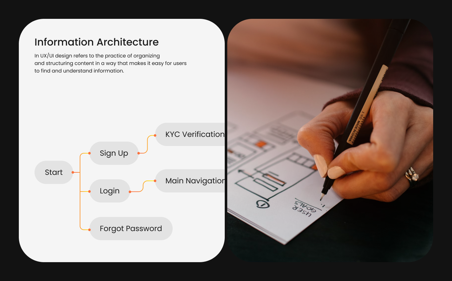
The Customer Journey Map served as both a diagnostic and strategic design asset—it visualized the user’s end-to-end experience, highlighting:
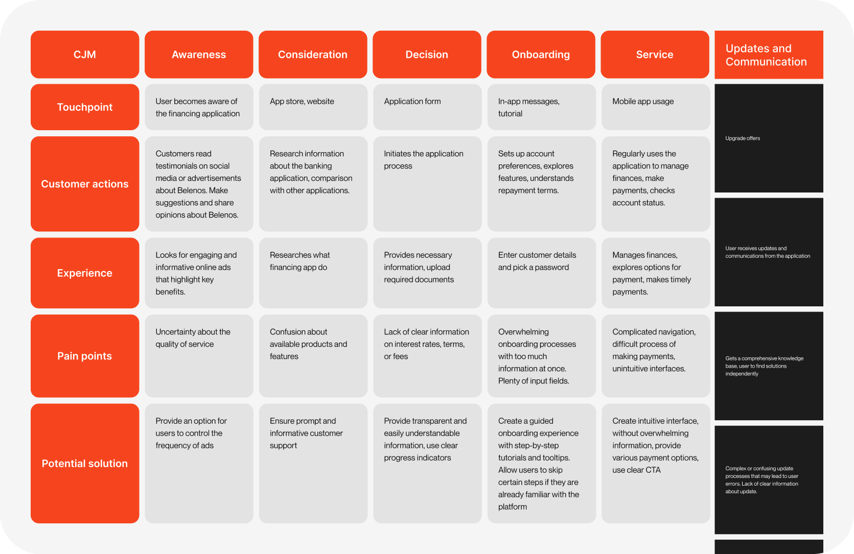
Before diving into detailed wireframes or visual design, we focused on establishing a clear and intuitive information architecture to support seamless user flow. The goal was to reduce cognitive friction and make navigation feel effortless, even for users who may be new to financial tracking apps. We began by mapping out all potential user tasks—viewing account balances, tracking spending, setting goals, analyzing trends—and organized them into logical groupings that reflected both frequency of use and cognitive expectations. Through card sorting exercises and stakeholder interviews, we identified core navigational pillars and secondary features, ensuring that every screen had a clear purpose and place. This foundation informed the layout of the bottom navigation bar and ensured consistency across modules. By structuring information in a way that mirrors how users think—not just how developers organize data—we made the entire product feel more intuitive, focused, and calming to use.
We started with a hybrid research approach:
Our primary user was a 25–40 y.o. urban professional, not financially illiterate but overwhelmed by budgeting tools or traditional banking apps. They value:
We structured the map into 6 stages, identifying the user's evolving experience at each point.
The CJM process directly informed:
By anchoring design decisions in a detailed CJM, we moved beyond guesswork. Every UI element had a job to do—ease friction, provide clarity, and instill confidence.
As we progressed beyond functionality, it was clear that Light needed more than just a working interface—it needed a soul.
We began with brand discovery, aiming to distill the emotional core of what Light meant to users. Financial tools often feel cold, rigid, and overly complex. Light, on the other hand, aspired to feel human, approachable, and, above all, empowering.
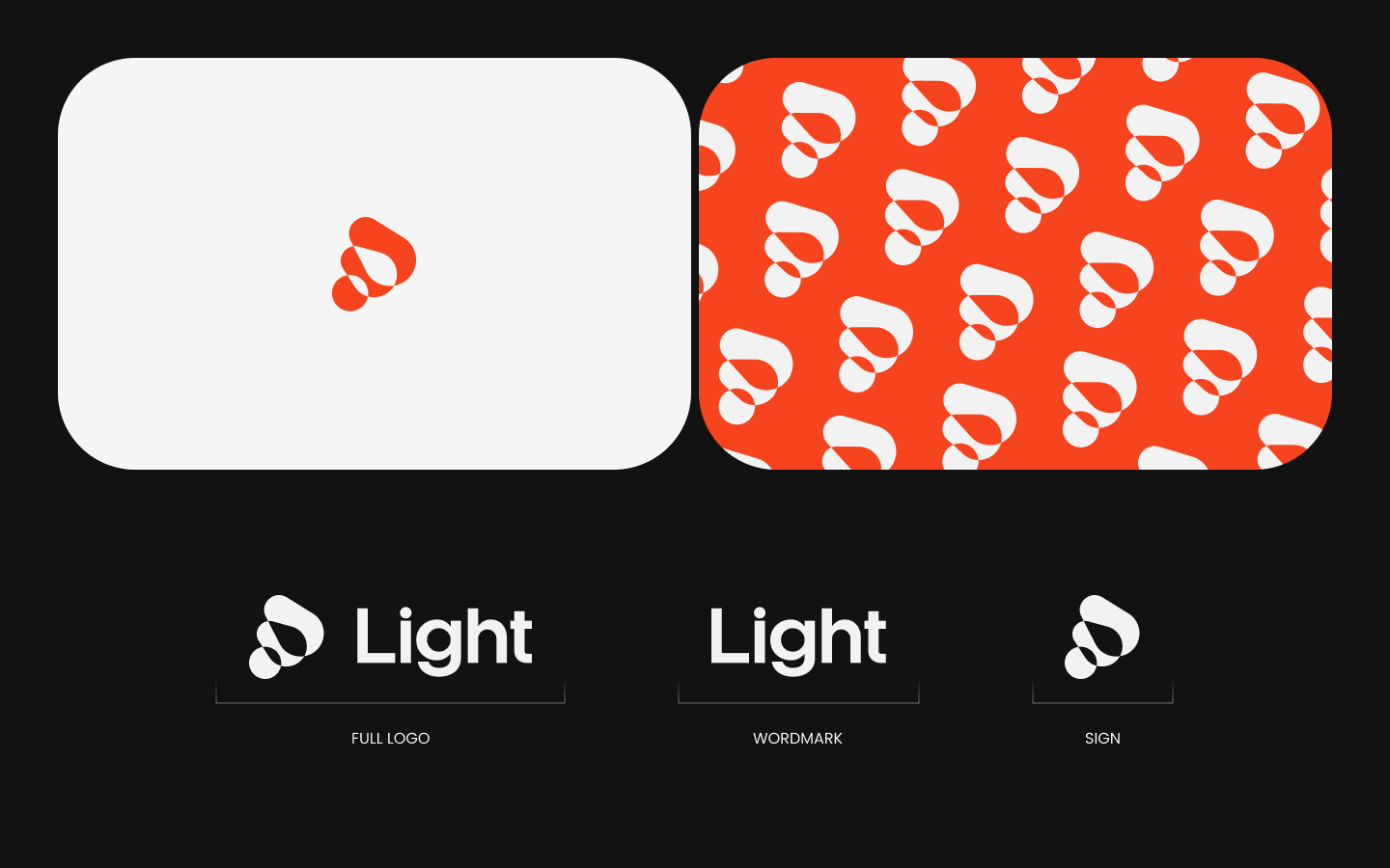
The name “Light” inspired our conceptual direction. We envisioned the product as a beacon in the often murky world of personal finance—a guide, not just a tracker. The logo was born from this metaphor: soft curves formed a shape reminiscent of both a lamp and a flame, a symbol of clarity, simplicity, and hope. Its vibrant orange hue radiated energy and warmth, setting it apart from the usual blues and grays of the fintech space.
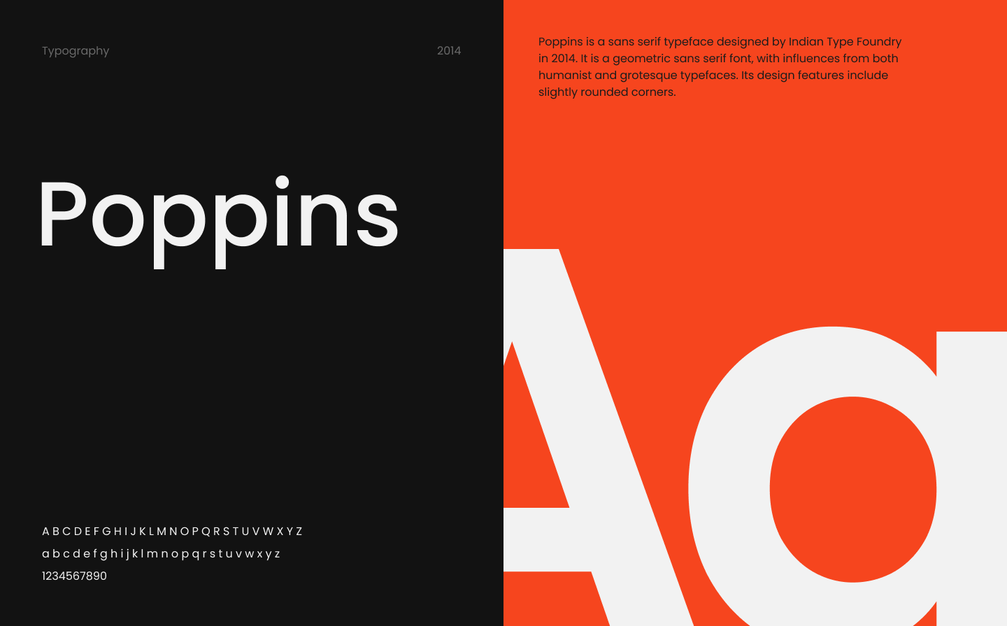
The broader visual identity took shape from this concept. We chose a friendly, modern typeface with rounded forms, subtle gradients to bring dimension, and clean white space to invite calm. Illustrations followed suit: minimal, organic, and always in service of reducing user tension.
This branding work laid the emotional groundwork that would ripple through every screen, every word, and every interaction in the app.
Once the branding was defined, we moved into UI concept development. At this stage, our goal was to bring the emotional weight of the brand into interface reality.
We designed a series of exploratory high-level mockups that showcased key moments in the app experience: the home dashboard, the monthly financial summary, and the expense tracking view. We asked ourselves: how can we make someone feel in control the moment they open the app? How do we create a sense of progress, even when the numbers aren’t perfect?
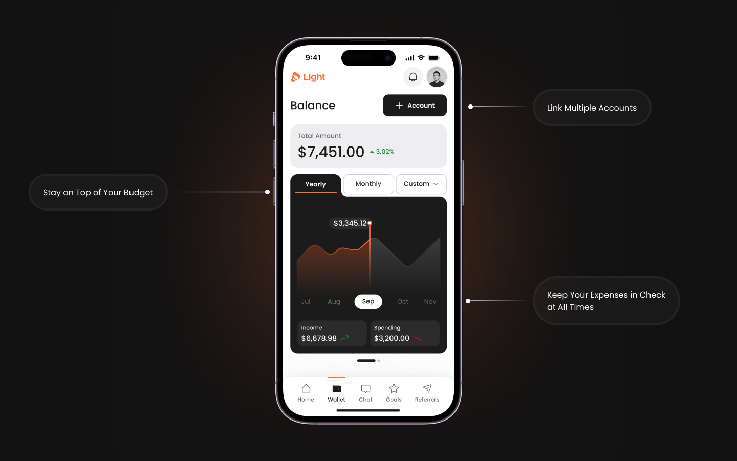
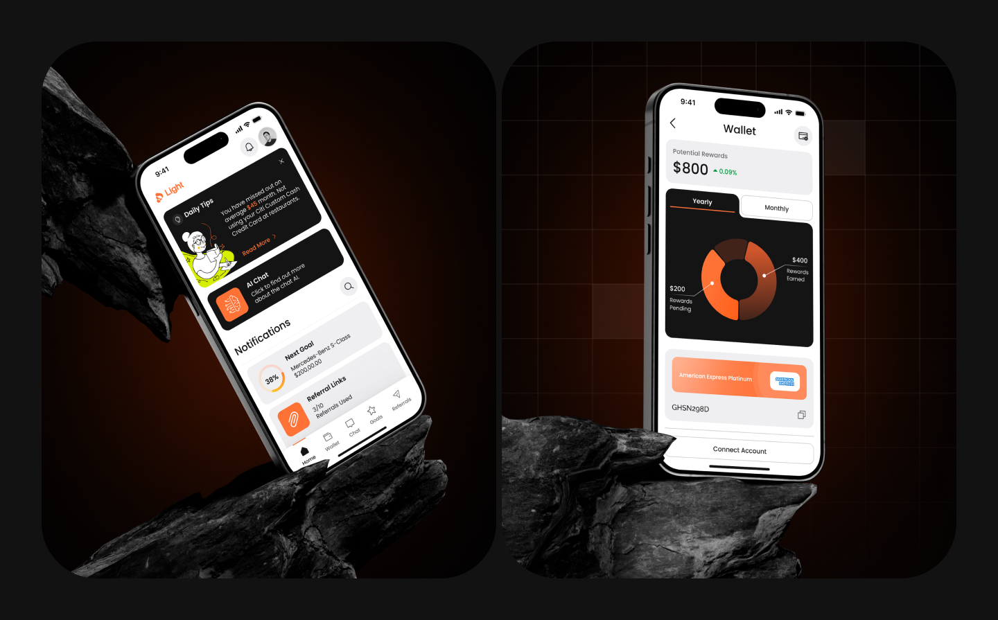
The dashboard became a centerpiece. It featured a clear balance display, color-coded graphs for spending and income trends, and dynamic toggles between daily, monthly, and yearly views. Every visual decision aimed to reduce friction: soft shadows, intuitive icons, and intentional white space that allowed users to breathe.
Presenting these concepts to the client helped us refine our tone, clarify hierarchy, and strengthen the sense of calm. We received immediate feedback on interactions and visual density, which allowed us to align perfectly before moving into full execution.
Armed with validation, we transitioned into full high-fidelity design. We transformed the client’s initial rough wireframes—functional but flat—into a living interface that radiated clarity and purpose.
Each screen was carefully constructed with modular components from a flexible design system. Buttons, charts, and cards were all built with responsiveness in mind. The bottom navigation bar featured recognizable icons for quick access to Home, Insights, Expenses, and Settings. Micro-interactions like tap feedback, subtle transitions, and loading states were all mapped out for future development.
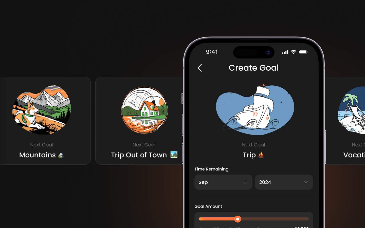
Special attention was paid to edge cases—what does the app look like when there’s no data yet? How does it guide new users without overwhelming them? We introduced helpful placeholder text, encouraging illustrations, and contextual hints that made onboarding feel personal rather than procedural.
By the end of this phase, the app not only looked beautiful—it told a story with every tap.
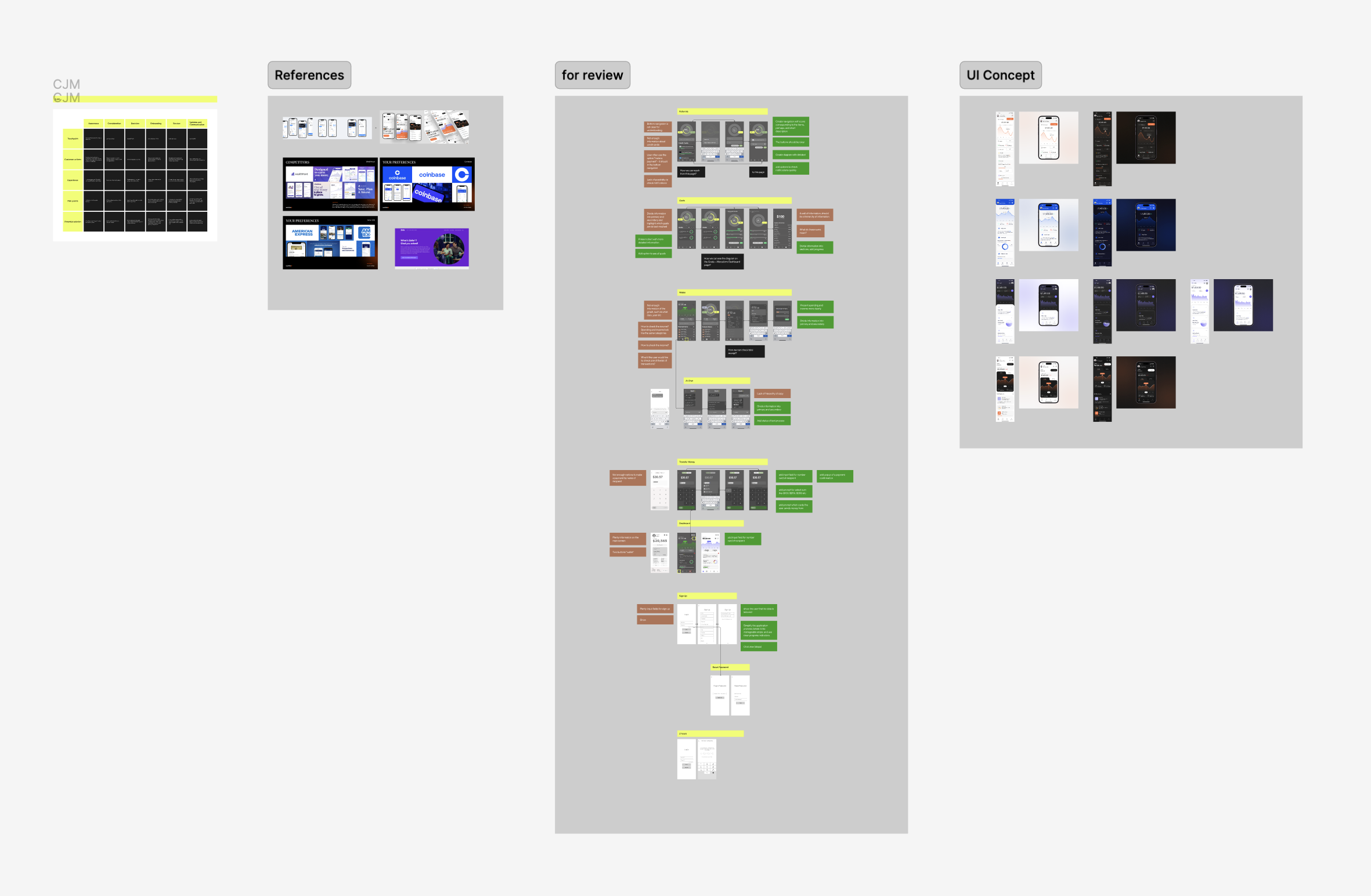
With a rich set of high-fidelity screens in place, we brought them to life through an interactive prototype in Figma. This clickable experience simulated core user flows—viewing balance trends, adding expenses, and exploring insights—allowing the client and stakeholders to experience the app firsthand.
We crafted the presentation not as a design review, but as a narrative walkthrough. We told the story of Light: where it began, what users needed, how design decisions supported those needs, and how the visual language communicated calm, control, and confidence.
This prototype was more than a deliverable—it became the centerpiece of the client’s investor pitch deck, showcasing not just what the product could do, but the experience it promised. The pitch was a success: the client raised $2.8M in funding, with the design and brand direction cited as major contributors to the product’s perceived value and future potential.
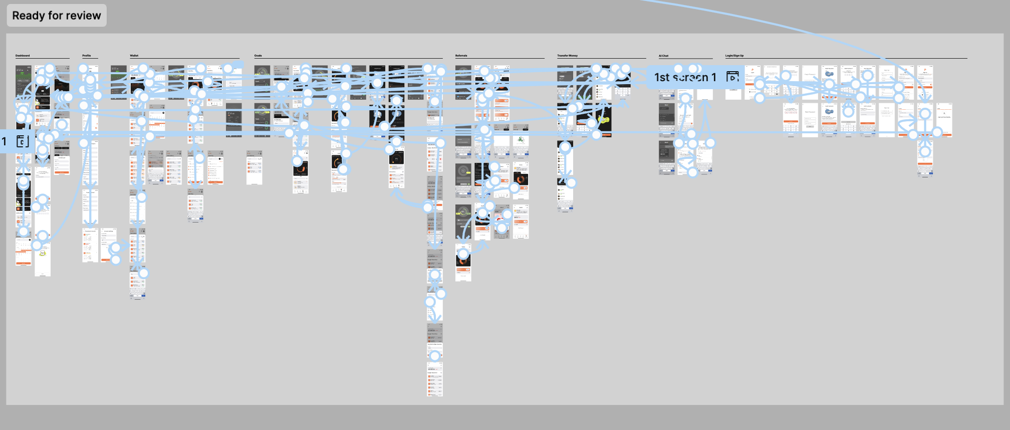
The Light mobile app design project not only met the client’s expectations—it laid a durable foundation for the product’s growth, development, and funding trajectory. By blending a thoughtful brand identity with a functionally robust and emotionally intelligent interface, we delivered far more than just a polished prototype.
Here’s what we achieved:
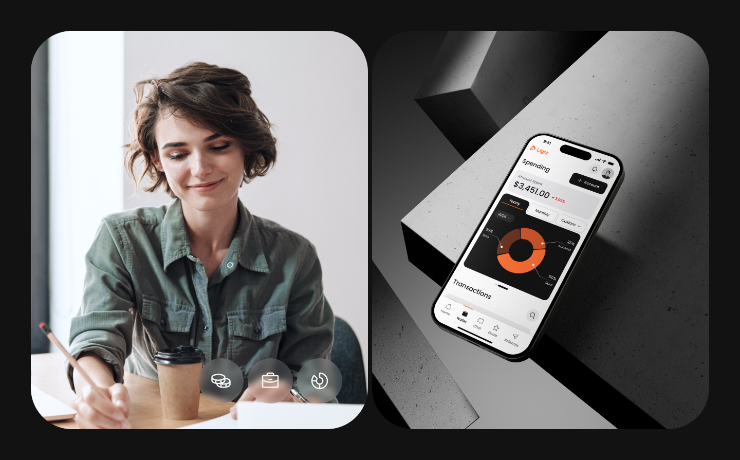
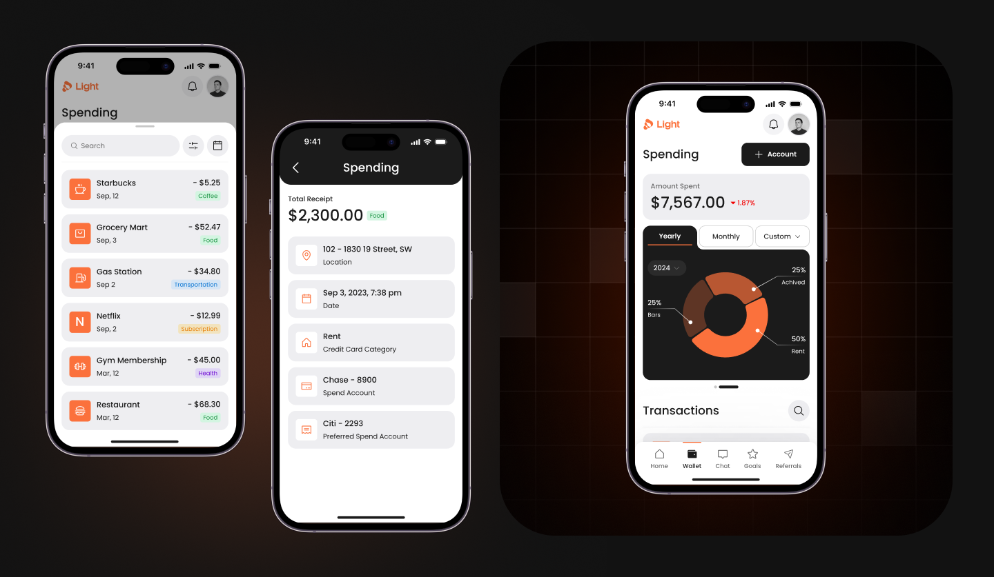
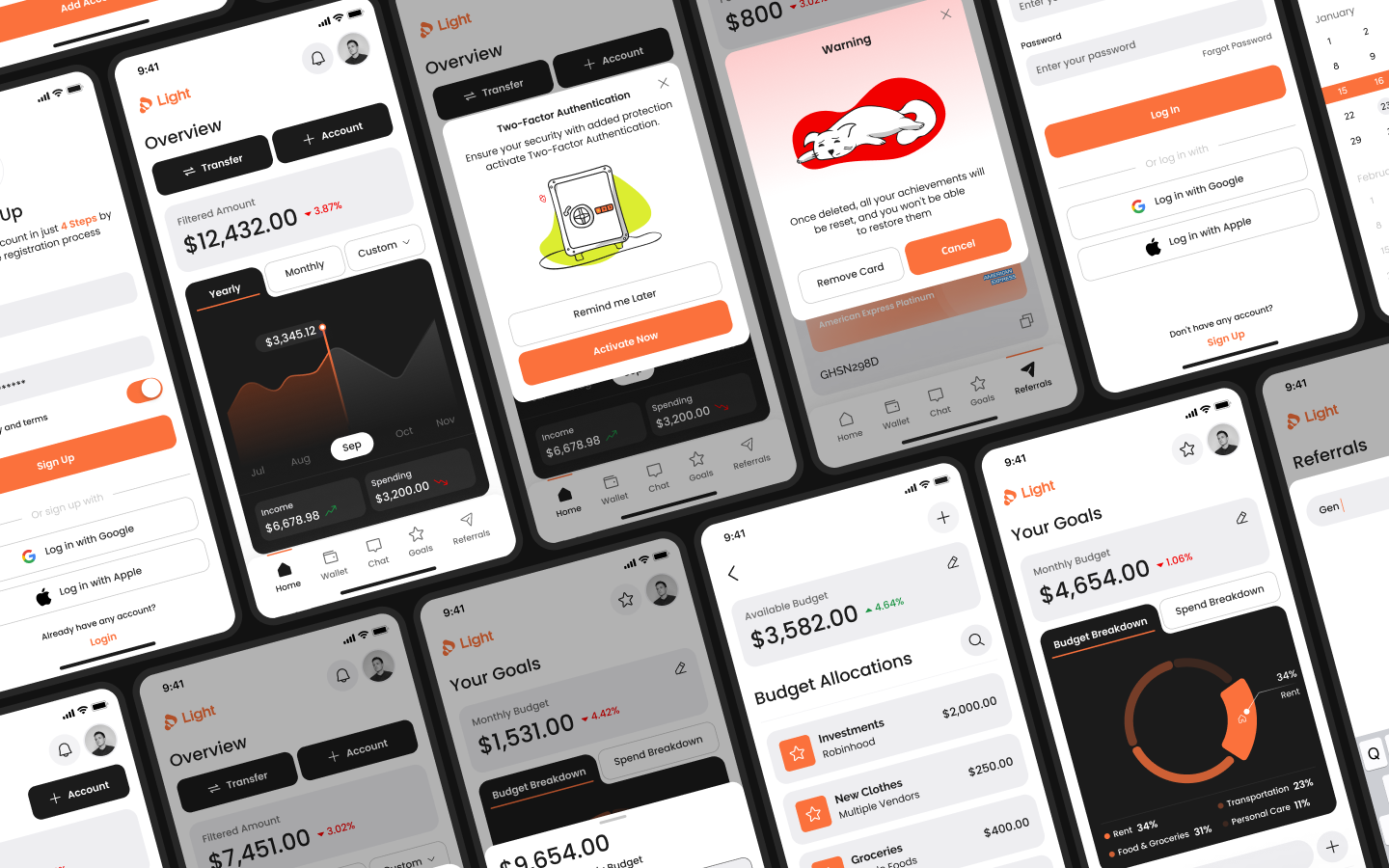

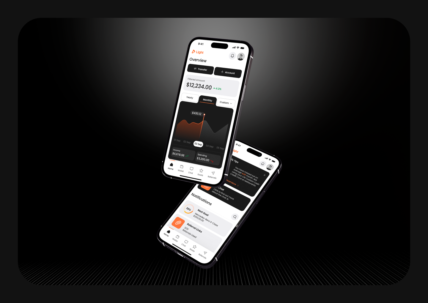
The Light app is now positioned to enter development with a clear direction and investor support. But more than that, it’s equipped with a design ethos that will serve users long after launch—one that respects their time, their mental energy, and their financial journeys.