During 2024-2025 I've worked as a part of Alterscope - a FinTech high-growth Product-Led startup that offers a cutting-edge platform designed to process and model risk in real.
I did a platform design, Website, Landing page designs and marketing design to help pitch the investors. Alterscope has been able to raise $2,8M so far.
When Alterscope first reached out to us, they weren’t lacking vision—they had that in spades. What they lacked was clarity.
Their alpha product was already doing something remarkable: aggregating complex data across blockchain protocols, chains, and liquidity pools in real-time. It was a powerhouse of DeFi risk intelligence. But to the users—portfolio analysts, risk managers, DeFi protocol teams—it felt like walking into a control room with no labels on the buttons.
Insights were hidden behind layers of obscure UX patterns. Navigation felt like guesswork. Despite the brilliance of what was happening behind the scenes, users felt lost.
Alterscope had three weeks to refine the product into something investors could understand, trust, and believe in. That’s when we stepped in—with one clear goal: transform a dense, technical alpha into a compelling, user-centered experience.
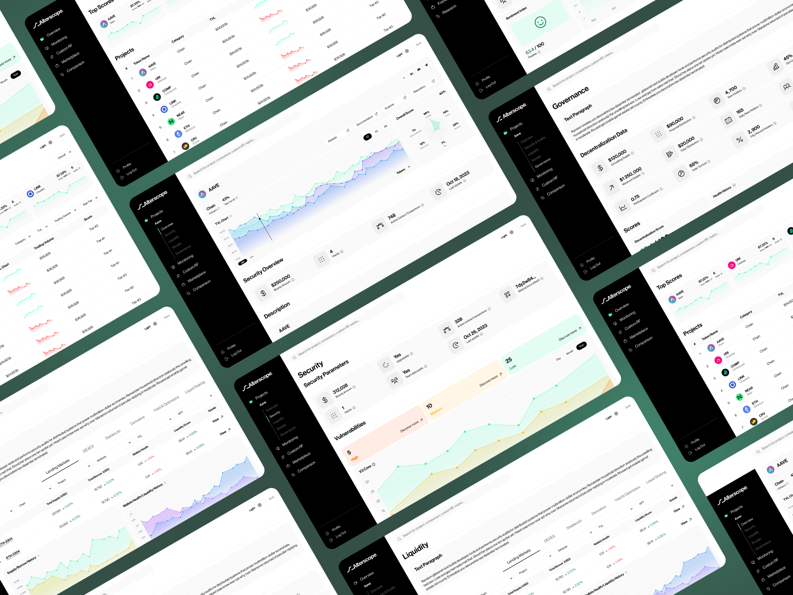
Before we laid down a single wireframe or defined a visual style, we committed ourselves to understanding the people who would use Alterscope. We knew that designing for DeFi isn’t about making things pretty—it’s about making the complex understandable, and making critical decisions feel safe and supported.
To do that, we had to first immerse ourselves in the minds of our users. Who were they? What kept them up at night? What did "clarity" actually mean in the context of real-time financial risk?
We began by building a map of our user personas:
Each of these users had distinct workflows, but they shared one thing in common: they needed visibility into a system that rarely reveals itself clearly.
We developed tailored interview scripts for each persona, focused on five core areas:
Over the span of a week, we conducted 12 in-depth, one-on-one interviews via Zoom, each lasting between 45 and 90 minutes. We recorded all sessions (with permission) and took simultaneous observational notes to capture emotional cues and hesitations.
These conversations were rich, and often surprising.
These weren’t just usability issues. They were deep trust gaps, emotional stressors, and systemic frictions that design had to address.
After the interviews, we generated full transcripts and moved into qualitative analysis mode.
Using a digital whiteboard and an affinity mapping framework, we broke the transcripts into hundreds of atomic insights—quotes, observations, pain points, and desires.
We tagged each insight by theme:
These insights were then grouped into patterns, allowing us to surface recurring issues and latent needs. This wasn’t just data—it was a narrative of frustration and aspiration
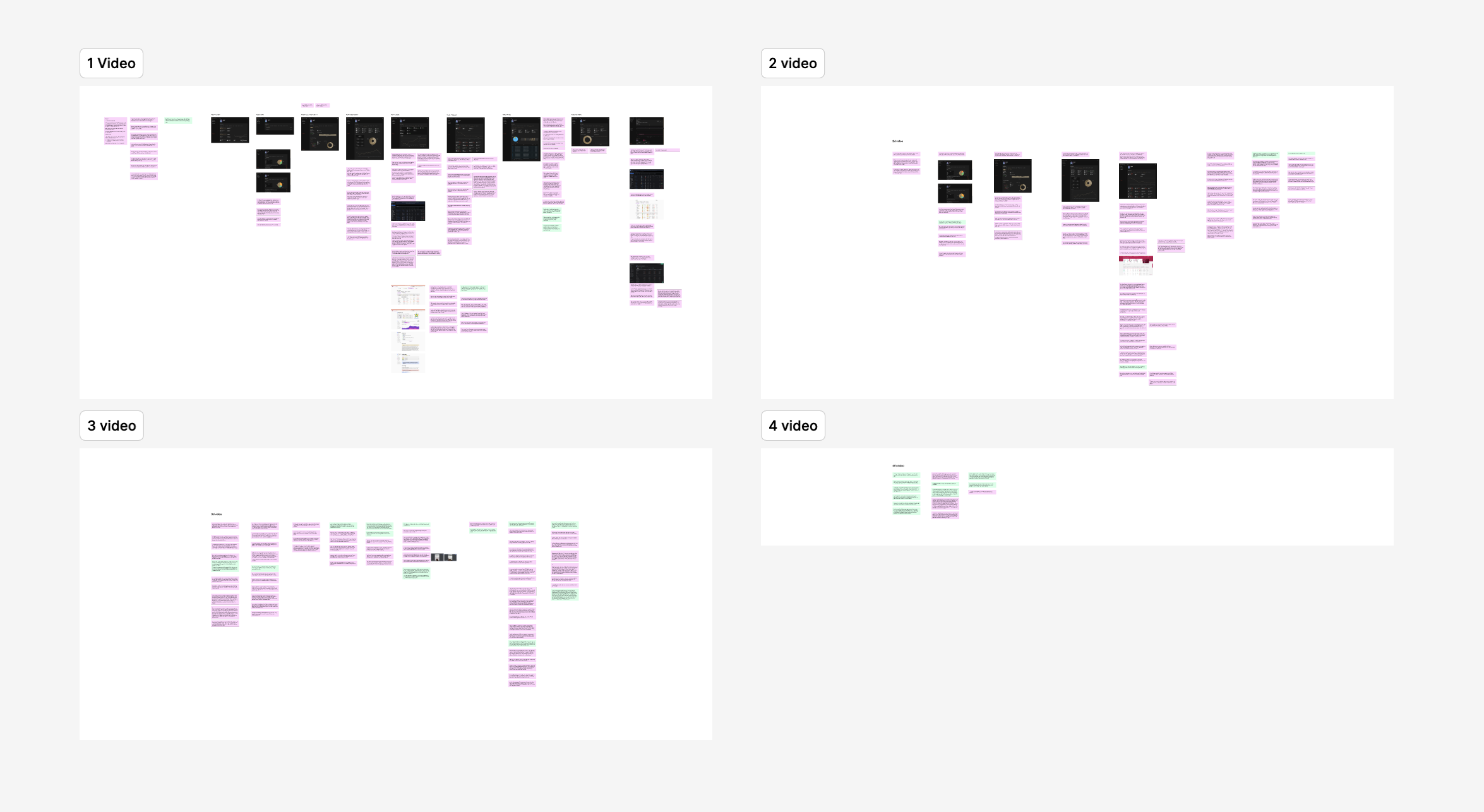
We took our affinity clusters and distilled them into a prioritized list of core design problems. Each one was supported by multiple user quotes and observations:
PriorityProblem StatementEvidence from Interviews1Users cannot easily identify or interpret key metrics at a glance“I don’t know what to look at first.”2Navigation is unintuitive and does not reflect mental models“I feel like I’m clicking around blindly.”3Data visualizations are dense, inconsistent, and visually unclear“The chart looks cool, but what’s it actually telling me?”4Lack of contextual guidance breaks trust in insights“I don’t act on something I don’t fully understand.”5Important interdependencies are buried in static views“I want to explore how protocols are linked, not just see them in a list.”
These became our design imperatives—guidelines that informed every UX decision, every layout, every component.

Our research didn't end with interviews. We brought several participants into the next stages of the process:
They became co-creators, not just informants. And the result was a product that felt like it was built for them—because, in many ways, it was.
Too often, user research is treated as a checkbox. For us, it was the foundation.
Every pixel of the final Alterscope redesign was anchored in real human insight—stories of confusion, uncertainty, and the deep desire for clarity in a trustless system. That’s what made our design not only more beautiful, but more believable.
Because in DeFi, you’re not just designing tools—you’re designing trust.
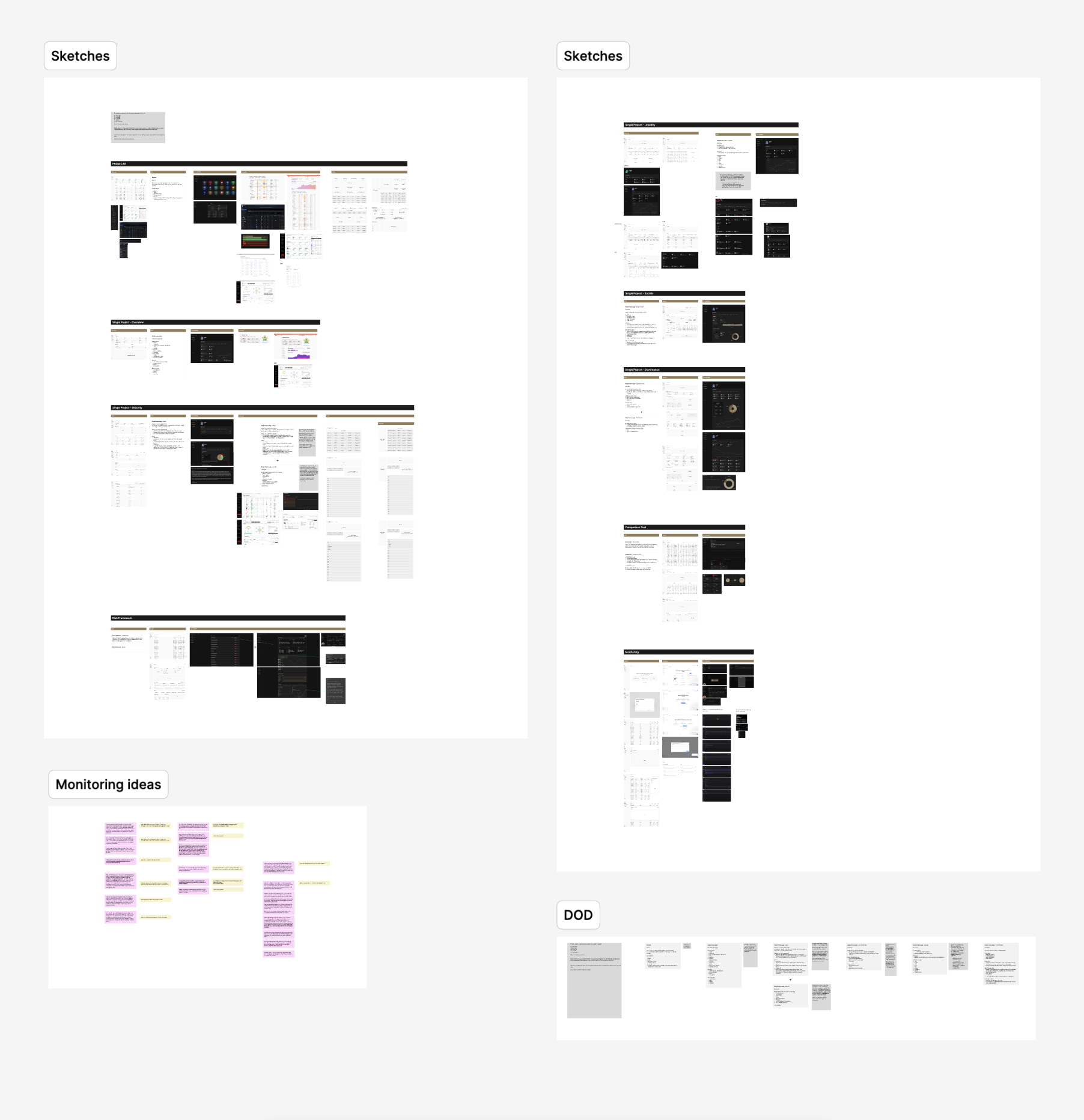
Armed with insights, we sketched, scrapped, and sketched again.
We created low-fidelity wireframes that focused on information hierarchy, not aesthetics. Our approach was storytelling through layout:
We prototyped multiple flows around critical use cases like:
Each prototype was validated in mini-feedback loops with internal testers and external users. We worked in clickable wireframes, refining based on comprehension and user recall—not just preference.
Once the structure was sound, we shifted into visual design. This wasn’t about decoration—it was about building trust through consistency, accessibility, and thoughtful visual storytelling.
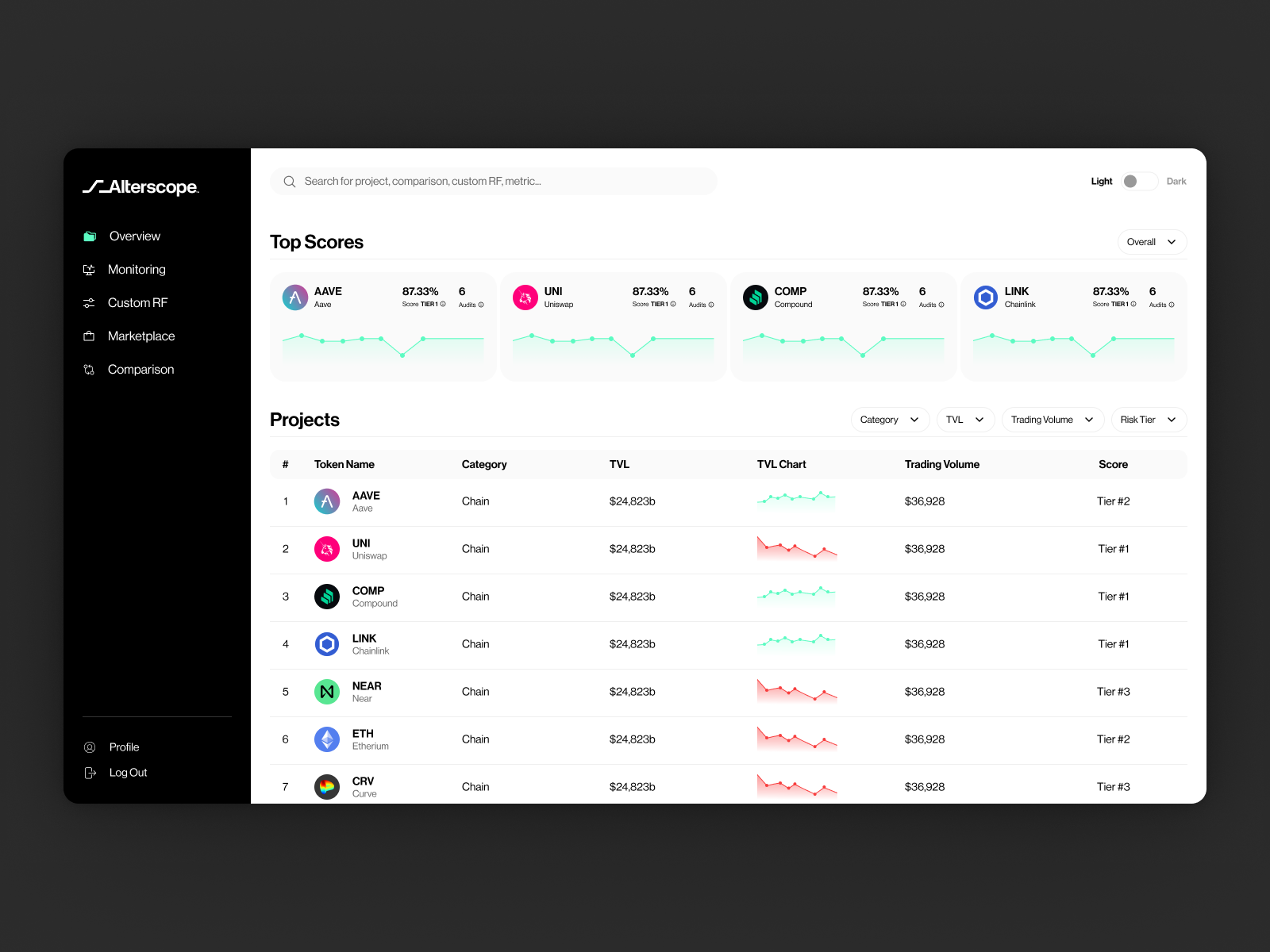


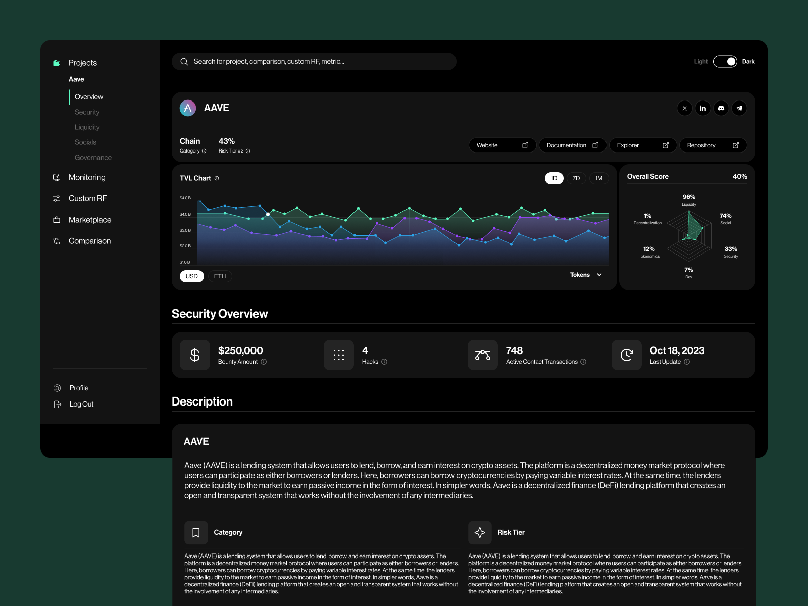
We created a full design system, documented and modular, allowing engineers to ship fast and iterate confidently.
To ensure we weren’t designing in an echo chamber, we launched a series of moderated usability tests with both old and new users. Our metrics of success weren’t vanity-driven—they were grounded in cognition:
We used tools like Maze and Lookback for asynchronous feedback and heatmaps to gauge attention. These tests led to quick, data-driven refinements—like adjusting label terminology, tweaking layout alignment, and reinforcing UI transitions to improve interpretability.
Beyond the launch, the modular design system and our user-centered approach became embedded in Alterscope’s product culture. Their internal teams now use the design language and research tools we established to continue improving the product.
Designing for decentralized finance is never just about screens—it’s about surfacing the signal from the noise. In Alterscope’s case, that meant translating real-time data into human-readable insights, and technical complexity into visual clarity.
Our biggest lesson? You don’t design great products by knowing all the answers. You design them by knowing the right people to ask—and listening deeply.
This project wasn’t just a sprint. It was a story of transformation—of a product, a team, and the way DeFi sees risk itself.
At the intersection of storytelling and product strategy lies a challenge every startup faces: How do you explain a highly technical, visionary product to investors who don’t live inside your ecosystem?
With Alterscope, that challenge was even greater. We weren’t just describing a product—we were introducing a new category: real-time, multi-layer risk intelligence for DeFi ecosystems.
To bridge that gap, we designed not just a pitch deck, but a fully immersive proof-of-concept demo experience. Together, they didn’t just explain Alterscope—they proved it.
While the core platform was still being rebuilt from the ground up, the team needed a way to visually and interactively demonstrate its future state to investors—without waiting for full development.
So we designed a high-fidelity, clickable proof of concept, tailored for investor use cases:
This demo became more than a tool. It was a visual conversation starter, translating technical depth into intuitive moments of “Oh—I get it now.”
In parallel, we redesigned Alterscope’s investor pitch deck to sync perfectly with the proof of concept—so every chart, claim, and ambition was visually anchored in a tangible experience.
The result was a deck that didn’t just say, “Here’s our product”—it showed investors what was coming, and invited them to step inside that future.
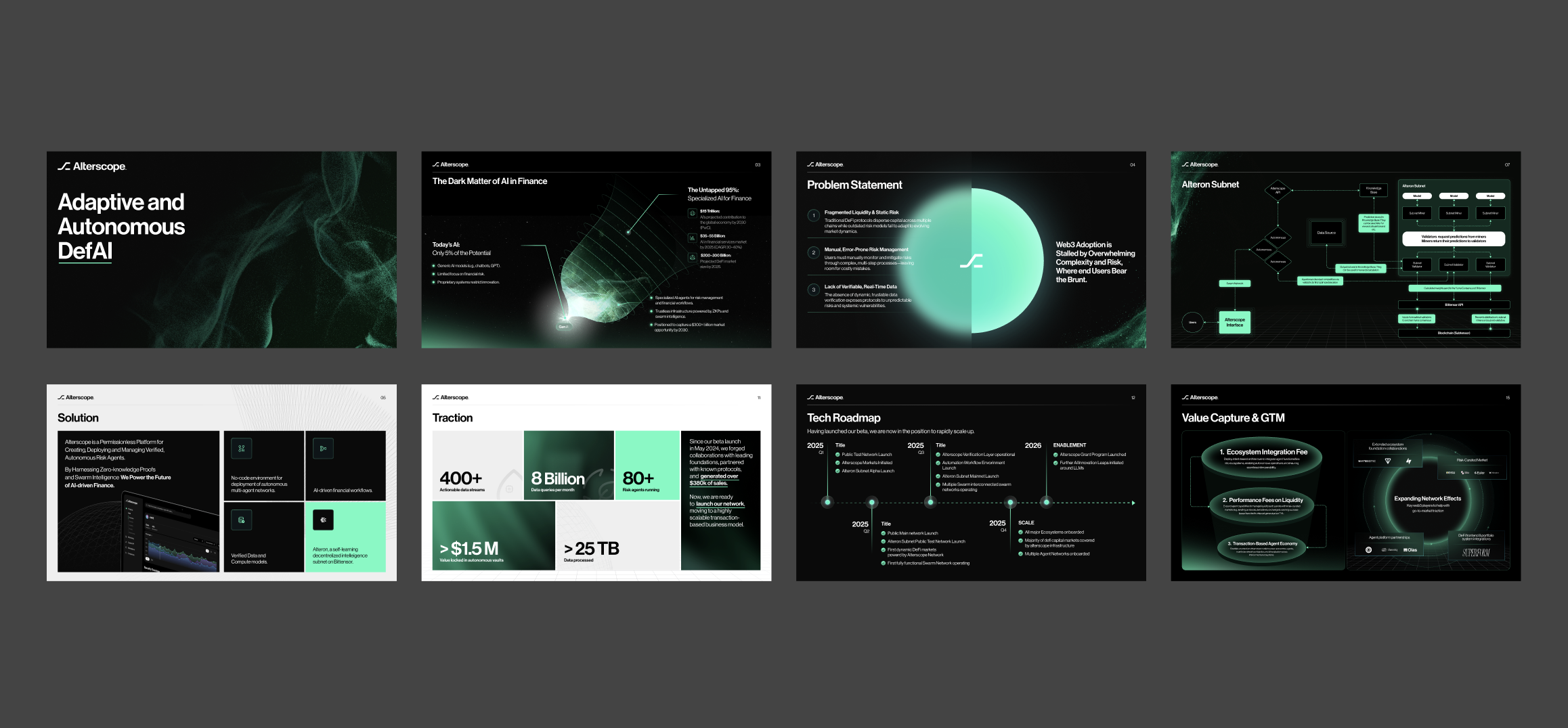
With the proof of concept and pitch deck in hand, Alterscope began a focused investor roadshow. The response was immediate and emphatic:
Within weeks, Alterscope secured $2.8 million in seed funding, backed by top-tier blockchain and fintech investors.
Design wasn’t decoration—it was translation, acceleration, and trust-building:
✅ It translated complexity into clarity
✅ It accelerated investor understanding
✅ It built trust through consistency, polish, and proof
Because when you’re pitching a future that doesn’t exist yet, the design is what makes it believable.