I led the design efforts of Stafftastic between April 2022 and August 2023 and collaborated with 10 software engineers, product managers, CMO, and CTO to fully revamp the user experience for the Praktikumswoche Web App. I’ve worked on the product during all phases of design and development, starting from user research and ending with full visual redesign.
I led the design efforts of Stafftastic between April 2022 and August 2023 and collaborated with 10 software engineers, product managers, CMO, and CTO to fully revamp the user experience for the Praktikumswoche Web App.
I’ve worked on the product during all phases of design and development, starting from user research and ending with full visual redesign.
As s part of a highly-skilled cross-functional team, we work together to identify and tackle problems that we identify from ongoing usability testing sessions, new user research data, and analyzing customer support requests.
In this case study I’ll showcase all steps that helped us become leaders in Germany’s Interns Recruitment market and help tens of thousands of companies find their interns in just a few clicks.
P.S. To comply with my non-disclosure agreement, I have omitted confidential information in this case study. All information is my own and does not necessarily reflect the views of Stafftastic.
In Germany, school leavers have the option of taking up a vocational apprenticeship instead of choosing full-time academic education. Known as ‘dual studies’ or referred to as the ‘dual education/apprenticeship system’, it is a highly regulated and well-regarded system whereby young people learn through a mix of ‘on-the-job’ training as well as in the classroom.
Typically, learners will spend 70% of their time in the workplace and 30% at college. Most apprenticeships take around three years and almost always lead to secure employment.
A system like that is extremely effective and perfect for gaining real, practical work experience that simply can’t be gained in a classroom. There is a high pass rate of around 90%. But how do young school students decide what they want to study? And how do you find a company for your apprenticeship?
We found a solution to that! Praktikumswoche is a Web Application that connects students with companies and allows students to try a profession they’re interested in for a week or less. In fact, the students can try a new profession every day (that’s why it is called Praktikumswoche).
What are the benefits for students? Well, the first thing that their calendar during the internship search process doesn’t look like that:
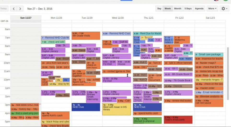
The German job market is showing stable growth, and the number of job advertisements is growing, but due to the lack of qualified workers companies are interested in finding young people, giving them proper training, and employing them as a result.
Based on extensive research and industry data, we identified several critical challenges within the platform that needed to be addressed. These challenges were impacting the customer satisfaction rate, hindering the attraction of new companies to the platform, leading to high form abandonment during the onboarding process and resulting in internship unattendance.From the business perspective, we found out that we need to tackle these problems first:
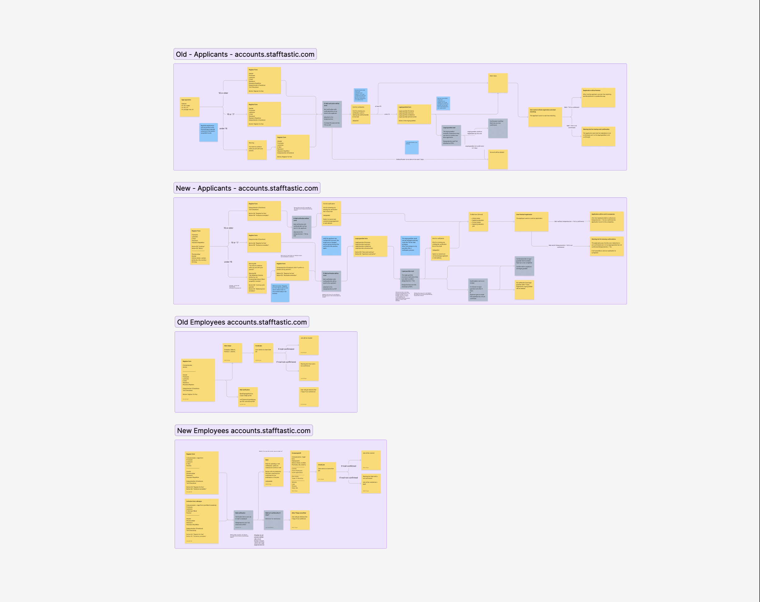
I focus on defining high-level functional flows and mapping out data elements. This approach aids the engineers in building robust data schemas and developing the app framework, resulting in a more efficient and streamlined development process.
Diagnosis, Insight, Action
Working closely with the Product Owner, I actively diagnose problems and identify opportunities. By delving into insights and leveraging the collective knowledge of the team, we are able to make informed decisions and take appropriate actions to drive project success.
Improving Processes and Fostering Collaboration
A key aspect of my role is to continually seek ways to improve the design working model and foster collaboration with engineers and Product Managers. Through effective communication and cooperation, we establish process standardizations that enhance efficiency and promote seamless collaboration across disciplines.
Upholding Design Quality
I place great emphasis on upholding design quality throughout the development lifecycle. This includes delivering solid craftsmanship, providing valuable feedback, and actively participating in bug bash sessions with the engineering team. By maintaining a high-quality standard, we ensure that the final product meets user expectations and delivers a superior experience.
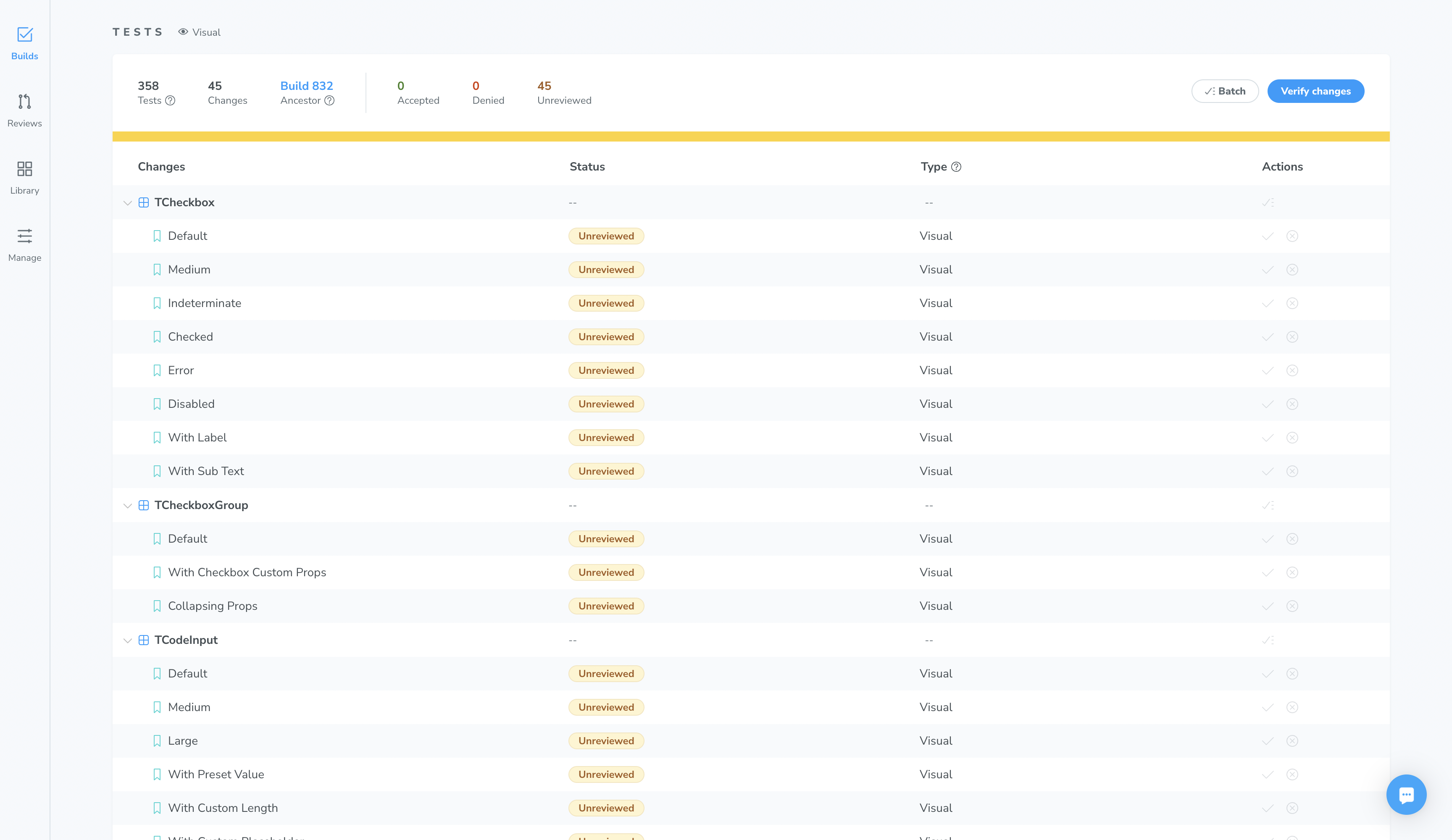
When I just entered Stafftastic, we had very limited engineering resources, so we were not able to fully redesign the platform right away, but we had an ambitious goal to make the onboarding process easier for companies and applicants and decrease the form abandonment rate.
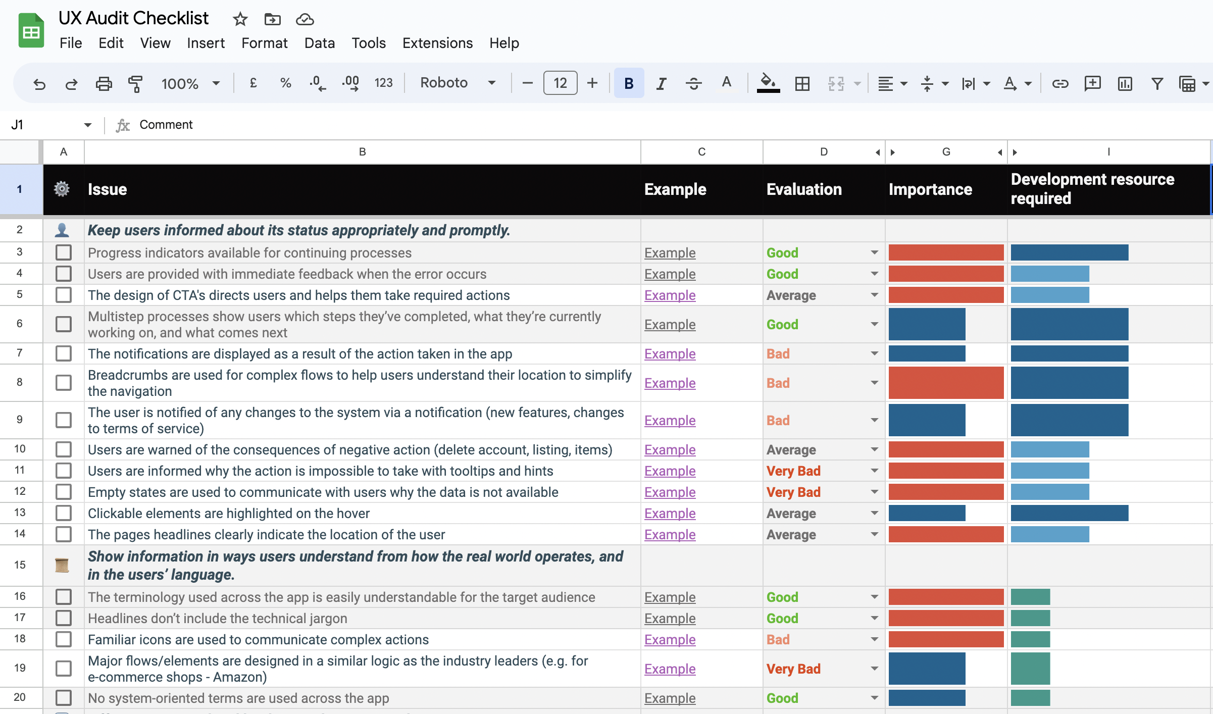
That’s why I’ve started by conducting an initial User Experience Audit to quickly measure the User Experience of the product. I’ve analyzed both classical usability aspects (efficiency, perspicuity, dependability) and user experience aspects (originality, stimulation).
Also, I used my own methodology of conducting UX Audits fast and organized an in-depth UX Audit report with actionable recommendations to improve the user experience of the platform.
The onboarding process is too lengthy and asks for unnecessary details
The onboarding process for our app was identified as a pain point due to its lengthiness and inclusion of unnecessary details. This hindered the user experience and resulted in user frustration and potential drop-offs. To address this issue, we sought to streamline the onboarding process and create a more user-friendly and efficient experience.
To validate our hypothesis, we conducted further user research and analysis to gain insights into user preferences and pain points. This research included surveys, user interviews, and usability testing. The data gathered revealed a common theme: users found the onboarding process overwhelming and time-consuming, leading to a high abandonment rate.
Progress indicators are not available for continuing processes
One of the identified issues in our platform was the lack of progress indicators for continuing processes, particularly in the process of creating an internship by a company. This absence of clear progress indicators made the process confusing and cumbersome for companies, leading to a significant barrier in their willingness to accept interns. To address this problem, we aimed to enhance the user experience by implementing progress indicators and improving the process flow.
After identifying the problematic issues and brainstorming with a team to find the right solutions, I placed my feature enhancement ideas into this prioritization map which helps me prioritize the ideas by considering how much will the enhancement improve user experiences.
As a result, I settled on three ways that reflected these insights and have the highest users and business impact.
Based on the research findings, we implemented several key strategies to optimize the onboarding process:
Based on the initial research, we also implemented the following strategies to address the problem of the low companies engagement rates:
Accessibility was one of the first problems we tackled when improving the user experience of Praktikumswoche. In particular, I’ve fully audited the product and draw some ideas on how to make the product accessible for all people, especially for people with disabilities.
To move beyond the existing biases, I worked to advocate the approach of universal design with the team and communicated the value of designing for everyone so the product is accessible and useful for more people.
After communicating the value of universal design with a team, we’ve decided to start small and adapt the interface to existing standards so we can provide our services to more people. For that, I’ve conducted an accessibility analysis and made sure the product complies with WCAG 2.0 Accessibility Standards to make sure we’re not excluding a major part of our users from using a product and finding their career path.
After the first new design iteration, I went ahead and conducted a simple usability test with 8 internal team members.
What was especially useful, is that this iteration of design has been tested on a highly relevant group: current interns at our company, that are at the same time a huge part of our target audience, that is why I’ve considered testing results extremely efficient.
The main goal of the usability testing was to evaluate whether the new layout and interface are straightforward, how easy is it to use, and if the new iteration is more usable than the previous one. Also, we wanted to identify other issues that can be quickly addressed and improve the overall user experience.
The internal testing results have confirmed the right direction and have shown the overall improvement of the onboarding process usability. That is why we’ve decided to take our testing to the next level and conduct large-scale usability testing with real app users.
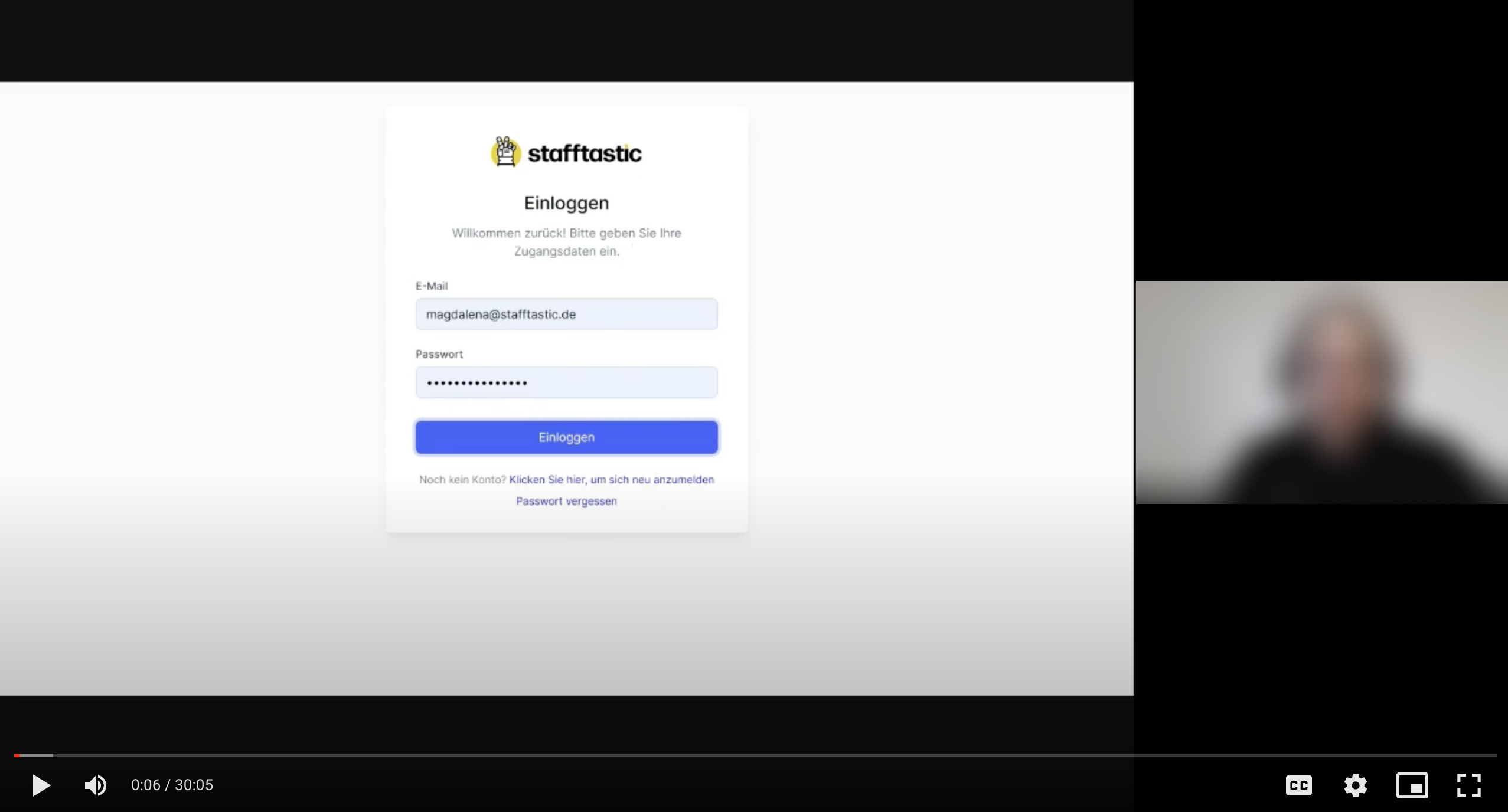
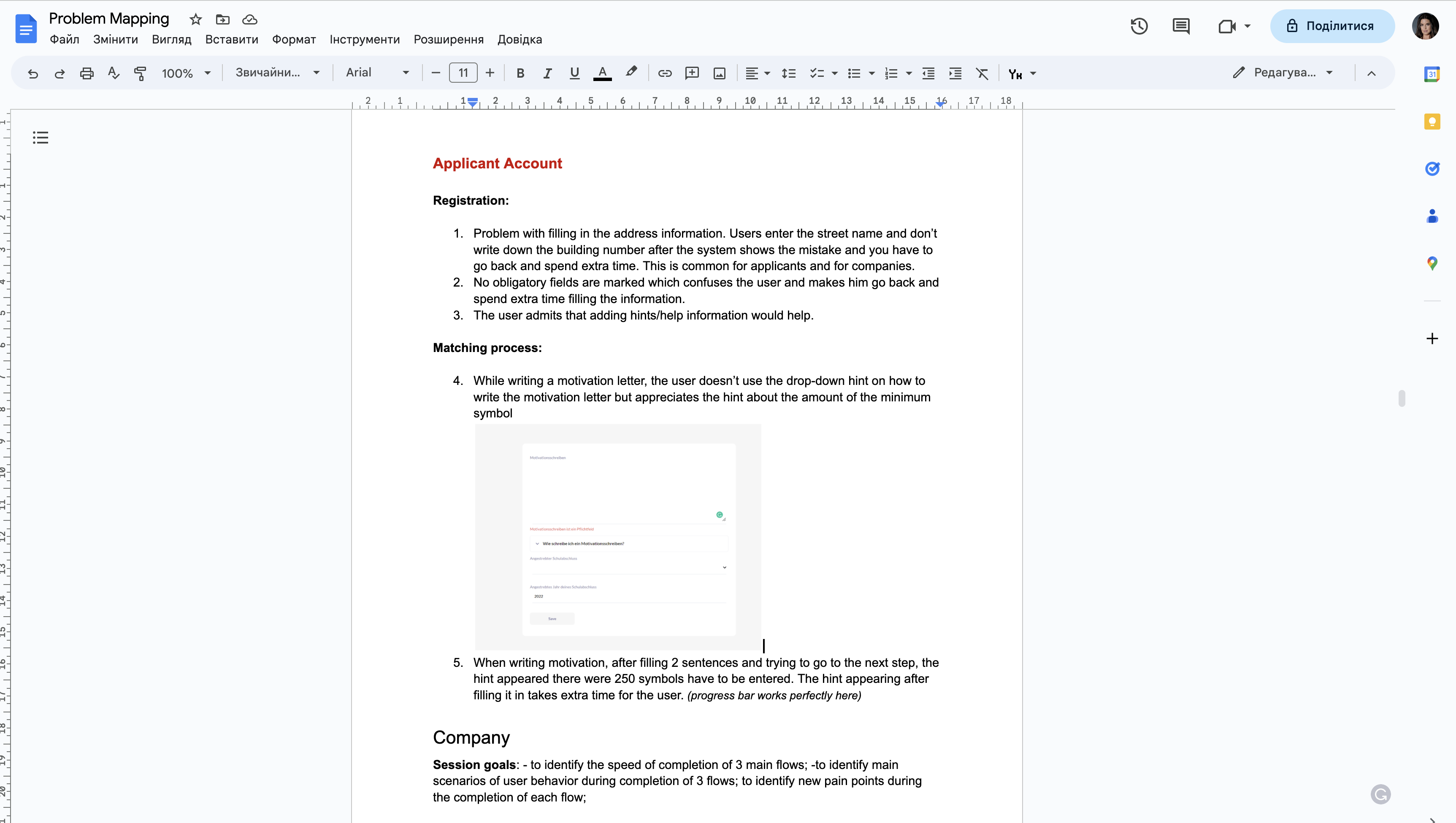
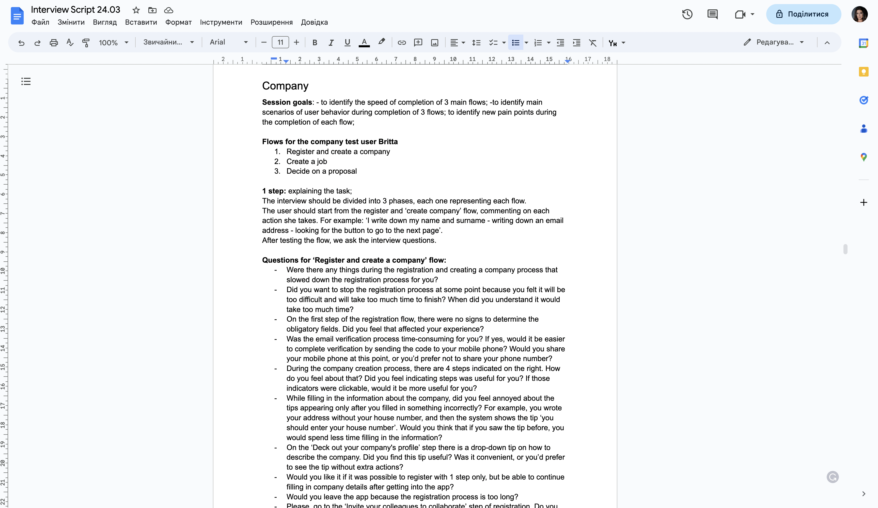
When conducting usability testing with real users, I always take enough time for preparation. In particular, before the series of calls I prepare the list of hypotheses I want to validate, the list of ‘rules’ to communicate before the start of the session, and the list of tasks for users and flows we want to test during the session.
In fact, before conducting the usability testing, I provide a full script with the timeline to make sure we’re organized and cover all data to gather enough feedback to validate our design solutions.
Positive Insights:
New major issues identified:
After gathering insights from our marketing department, and customer support representatives, we decided that we need to get to know our users better to be able to redesign the flows according to their needs.
One of our goals for this redesign was to simplify the processes and make them more intuitive to increase engagement and attract more users, that’s why we needed a deep dive into what’s actually on our user's minds.
Let me explain my approach to conducting user research.
The first essential question: where do we find our users and how can we ask them to take part in user interviews?
This is a debatable question. While some designers actively recruit users on freelance platforms, or with other user interview tools, I tend to avoid ‘professional users’.
HOLD ON….WHAT IN THE WORLD IS A ‘professional user’?
It’s basically the type of users that find paid opportunities to take part in user research and make a living this way. Why these ‘users’ are irrelevant? Because they’re professionals. Even if they match your target audience, they unintentionally respond as you expect them to respond to get their job done. That’s the thing we certainly don’t want when looking for users.
That’s why I worked together with the marketing team to attract real users to take part in our user interviews. We sent out an Email to all platform users and received 30+ responses from people that were extremely active and were interested in improving the platform for free.
In conducting in-depth interviews for the platform, I follow a structured yet flexible approach to gain valuable insights from users and stakeholders. Firstly, I thoroughly prepare by defining clear research objectives and developing a comprehensive interview guide.
This guide includes a mix of open-ended and targeted questions tailored to the specific project goals. During the interviews, I strive to create a comfortable and non-judgmental environment, encouraging participants to freely express their thoughts, needs, and pain points. Active listening is key, as I carefully observe verbal and non-verbal cues to capture nuanced details.
I also employ probing techniques to dive deeper into participants' responses, ensuring a comprehensive understanding of their experiences and perspectives.
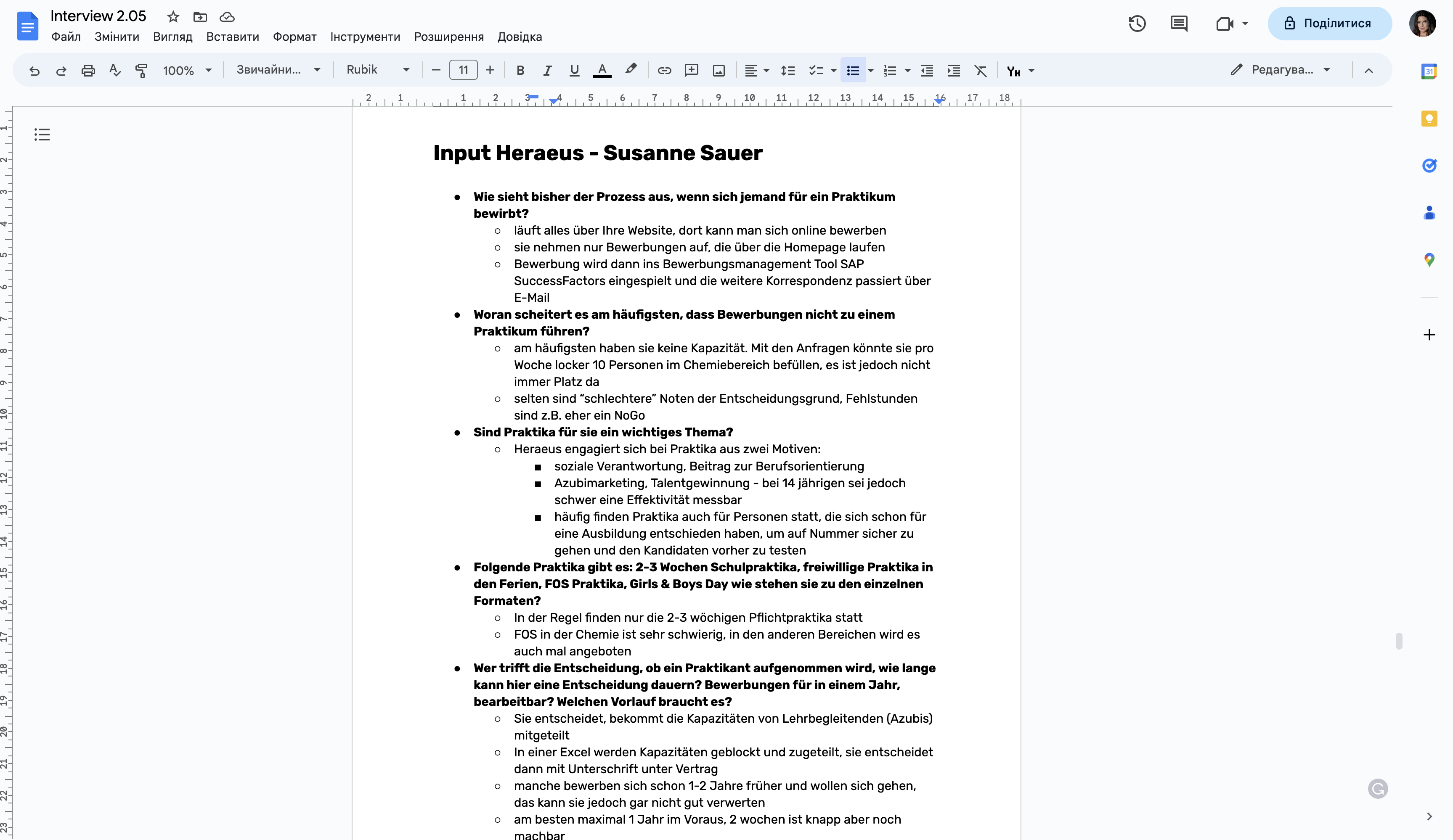
Insight #1
The main concern of companies is the fear that candidates would not be qualified enough
Insight #2
The main fear of employers is that the intern selected will not attend the internship
Insight #3
The main goal of the company is to find prospective employees to employ them in the future
Insight #4
The applicant is looking for reputable companies and is concerned about the lack of possibility to choose a company
Insight #5
The main reason why the applicant would not attend is the lack of motivation.
To properly analyze the user research findings and brainstorm ideas on how to improve the current user experience, I organized and facilitated a workshop where the design and engineering team generated ideas on how to solve user pain points discovered during the user interviews.
We’ve drafted some ideas on features that we’d like to introduce, taking into consideration the development cost and the relevance of the change. Also, we’ve discussed the risks that we might face if the design changes are too significant to prevent spending too much on unnecessary changes.
After the workshop, I took my time to evaluate the ideas and organize and prioritize them in a more organized and clear way. To do this, I employed a systematic approach using a prioritization spreadsheet to organize and evaluate each idea. I evaluated the ideas with various evaluation criteria such as cost of change, development resources required, relevancy to user needs, impact on user experience, and alignment with business goals. Each criterion was assigned a weight based on its importance. Next, I assigned a numerical score to each idea for each criterion, taking into account the team's collective expertise and insights gained from user research. The scores were then multiplied by the corresponding weights and summed up to obtain a weighted score for each idea. This approach enabled me to objectively assess and compare the ideas, giving higher priority to those that scored higher in critical criteria.
As a result, I’ve identified issues that should be tackled first, and together with the product owner, we’ve set up tasks in Jira for the issues that should be solved first. Also, we decided to keep some more costly solutions for the future so we can implement these changes when we have enough time and resources.

After prioritizing the solutions I’ve started working on improving the current user flow to enhance the user experience. Starting with drafting a new user flow, I’ve created some sketches to communicate improvements with the internal team. After another round of brainstorming with the team, I’ve drafted wireframes together with a fully-functioning interactive prototype to test out the solutions.
When improving the user flow for the Praktikumswoche Web App, I approached it with the goal of enhancing the user experience while minimizing significant changes that could lead to user confusion. Extensive research data support the importance of maintaining familiarity with design changes. According to studies, users can become disoriented and frustrated when faced with dramatic design alterations. Therefore, I focused on optimizing the existing user flow to avoid introducing significant changes that may overwhelm or confuse users. By prioritizing incremental improvements and minimizing disruption, we aimed to provide a seamless and intuitive user experience while addressing the identified pain points and challenges.
User flow updates:
Using the valuable data collected from usability tests, user research, and the prioritization list, I transformed insights into tangible wireframes and a fully functional prototype. Carefully analyzing the findings, I crafted wireframes that captured the optimal user experience, intuitive interactions, and seamless navigation. These wireframes served as a blueprint for developing a functional prototype that brought the design to life.
To validate the design and gather feedback, I conducted additional rounds of usability testing. Armed with the interactive prototype, I engaged users in testing sessions to observe their interactions and gather insights. The interactive prototype provided a realistic experience, allowing users to navigate through key features and perform tasks in a simulated environment. Through iterative testing, I refined the design based on user feedback, addressing concerns and improving the overall user experience.
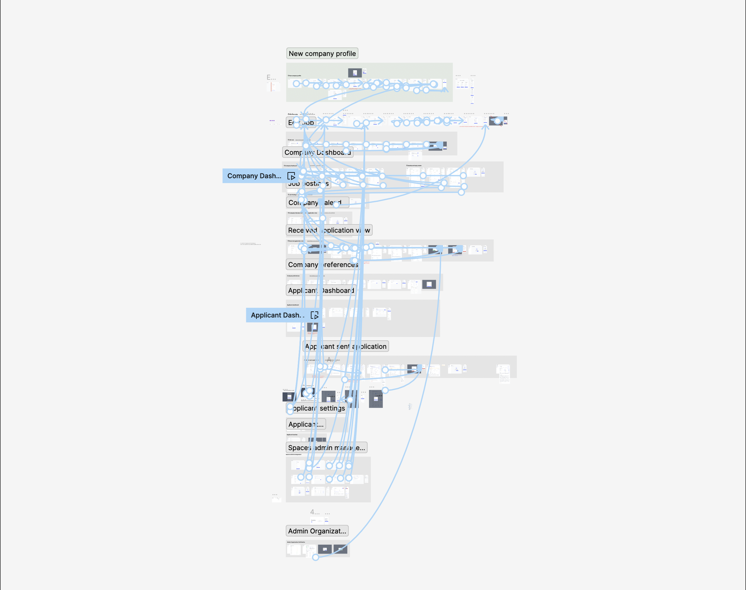
First, we adopted a guided step-by-step approach that divided the company creation process into clear and manageable stages. Each step represented a specific task or required information, allowing users to easily understand their progress and the remaining actions needed. This step-by-step structure provided clarity and guided users through the process, minimizing confusion and frustration.
In addition to the guided approach, we incorporated progress indicators to provide a visual representation of the user's advancement in creating a company profile. These indicators showcased the completion status of each step, empowering users with a clear understanding of their progress and instilling a sense of accomplishment as they moved forward. By visualizing their progress, users felt more confident and motivated to complete the process, resulting in higher engagement and a smoother experience.
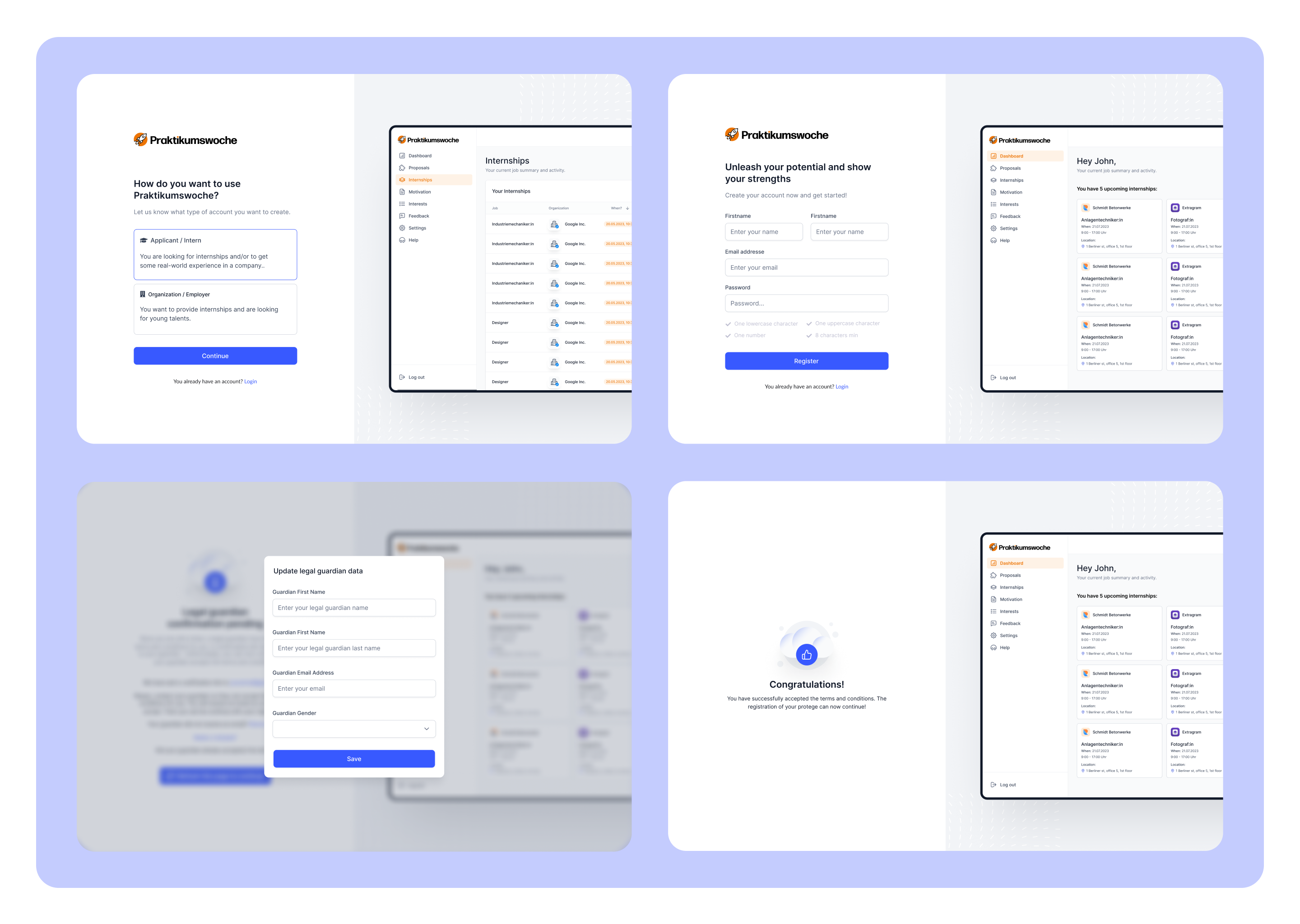
We implemented several improvements to the dashboard. First, by categorizing and grouping relevant information, we enhanced the overall clarity and ease of navigation, allowing users to quickly access the data they need. This structured approach eliminated information overload and improved the dashboard's usability.
In addition to data restructuring, we focused on meeting the aesthetic-usability effect by enhancing the visual appeal of the dashboard. We employed design principles such as clear typography, balanced layout, and cohesive color schemes to create a visually pleasing interface. By improving the aesthetic aspect of the dashboard, we aimed to positively impact user engagement and encourage companies to actively interact with the platform.
To combat internship unattendance, we introduced automated reminders and notifications for both companies and applicants. By implementing timely reminders and providing clear communication channels, we aimed to minimize the chances of applicants missing their internships and foster a more reliable and accountable experience. These measures aimed to improve overall attendance rates and create a positive internship experience for both companies and interns.
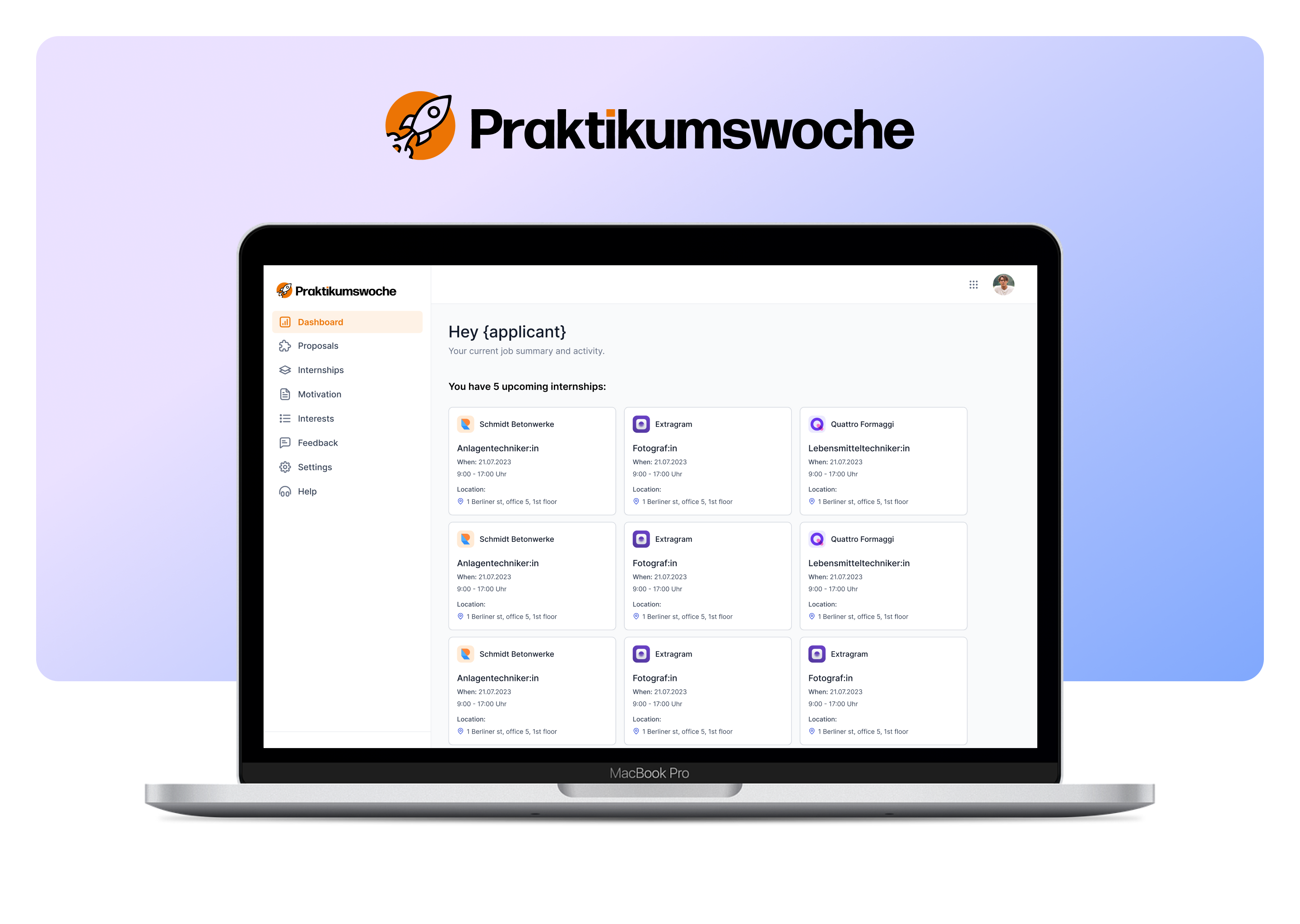
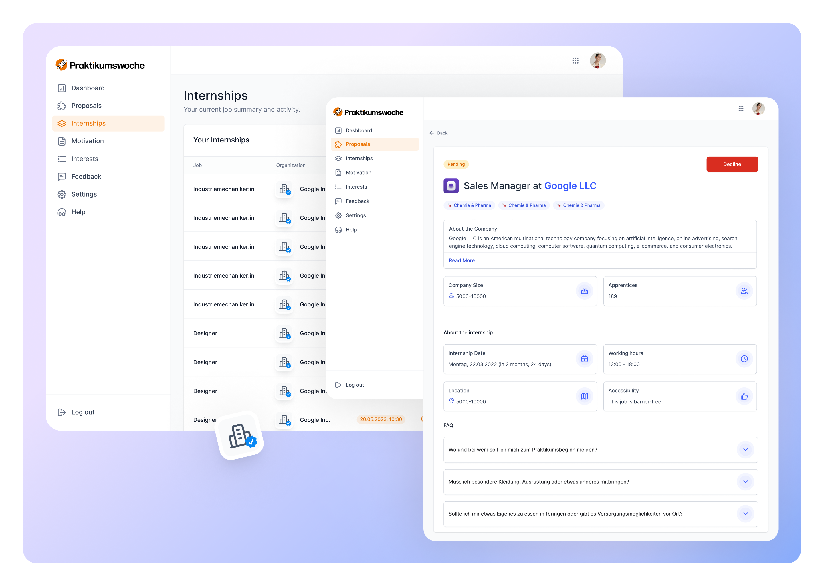
To address the challenges with the proposal view, we implemented key improvements to enhance engagement and alleviate concerns. Firstly, we redesigned the proposal view to provide comprehensive information about the company, showcasing its reputation, ratings, and reviews from past interns. This transparency aimed to instill confidence in companies, assuaging their fears about intern qualifications and encouraging them to accept proposals.
For applicants, we updated the proposal view to showcase key applicant information, such as relevant skills, qualifications, and experiences, in a visually appealing and easily digestible format. By highlighting the applicant's strengths and potential value to the company, we aimed to capture the attention and interest of potential employers. Additionally, we incorporated interactive elements, such as portfolio showcases or project samples, to provide a comprehensive and engaging overview of the applicant's capabilities. These improvements aimed to make the applicant proposal more compelling and increase its appeal to companies, ultimately encouraging greater engagement and consideration.
Also, we implemented a streamlined acceptance process for proposals, minimizing the steps required for companies to accept an intern. By reducing the effort and time needed to accept proposals, we aimed to improve company engagement and expedite the intern selection process.
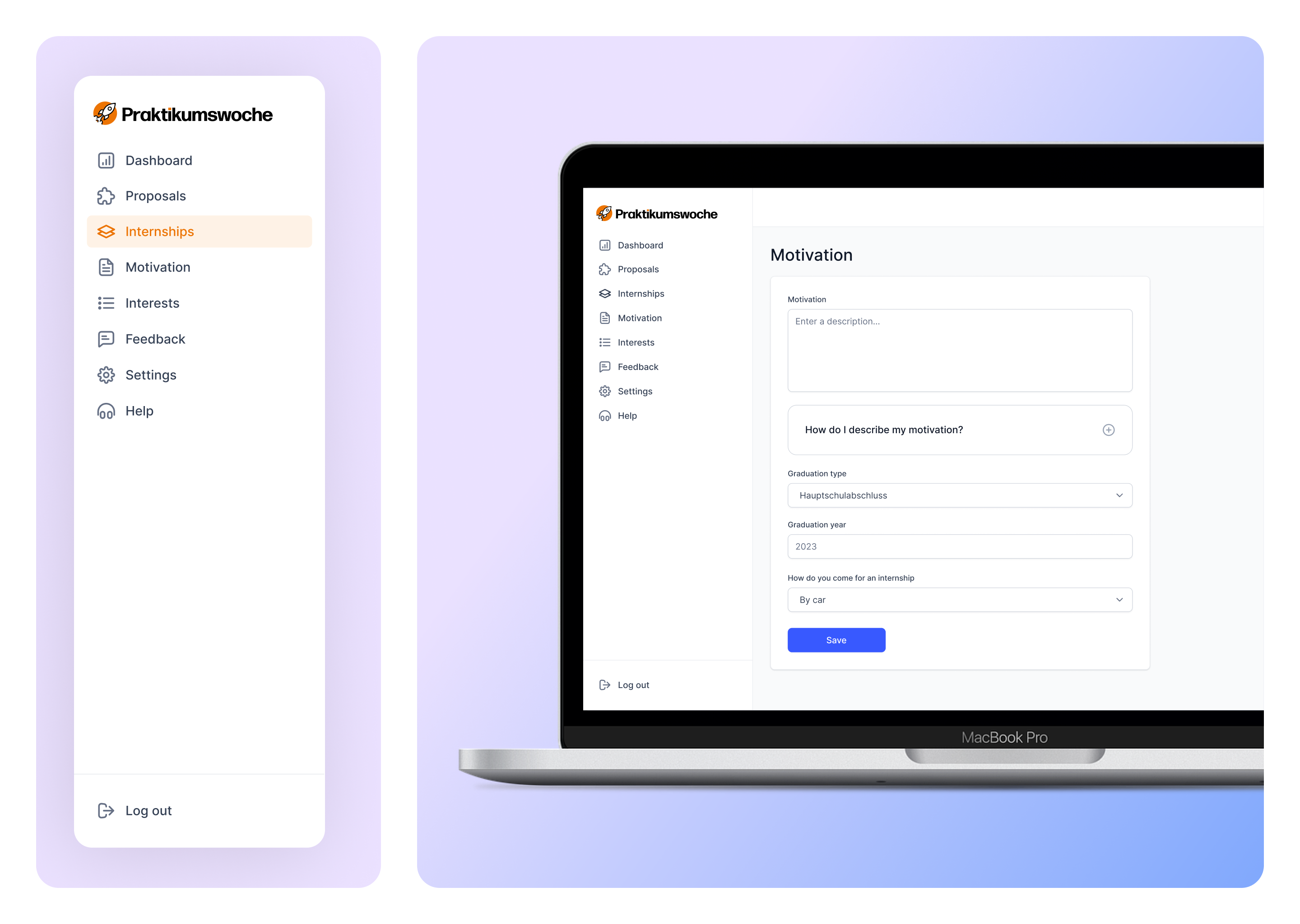
We introduced AI-powered assistance to simplify the cover letter writing process. By asking users only four key questions, our intelligent system generated personalized cover letters that were tailored to their needs. This streamlined approach significantly reduced form abandonment rates, as users found it easier and quicker to complete the required information. With AI assistance, users could create compelling cover letters that effectively showcased their skills and experiences, enhancing their chances of securing internships and attracting the interest of companies.
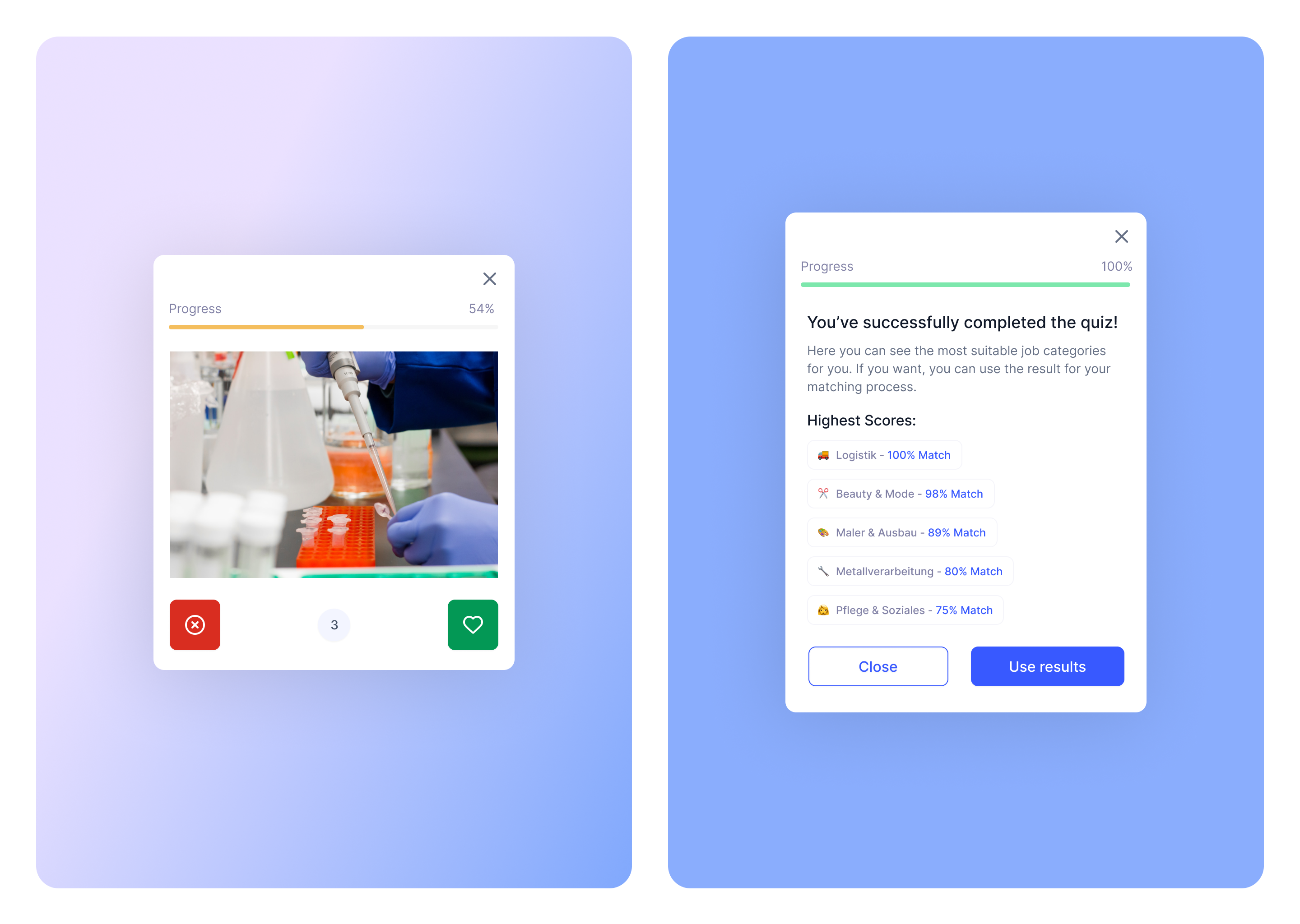
To improve the matching process, we decided to try helping interns choose occupations they’d like. I designed an interactive quiz to provide tailored recommendations based on the interns' interests, skills, and preferences. By answering a series of targeted questions, interns gained valuable insights into the occupations that aligned with their strengths and aspirations. This new feature helped interns make informed decisions about their career paths, ensuring a better match between their interests and the available internship opportunities. The quiz not only facilitated a more personalized and engaging experience but also contributed to higher satisfaction and increased intern engagement on the platform.
Recognizing that a significant portion of our applicants access our platform through mobile devices, we adopted a mobile-first approach in designing the applicant experience. This approach involved prioritizing the mobile user interface and optimizing the design to deliver a seamless and intuitive experience on smaller screens. By understanding the unique constraints and preferences of mobile users, we crafted a responsive and user-friendly design that accommodated the limitations of mobile devices while maintaining the core functionality and usability of the platform. Through a mobile-first mindset, we ensured that applicants could easily navigate, search for internships, complete forms, and engage with the platform's features, ultimately enhancing their overall user experience and satisfaction.
The redesign of the Praktikumswoche brought some challenges and required us to make careful considerations and compromises. One significant challenge we faced was the limited availability of engineering resources. With a small team, we had to prioritize our design improvements and work closely with the engineers to assess the feasibility and cost of each enhancement.
Through effective collaboration and regular communication, we were able to identify the most impactful changes while taking into account the resource constraints. This collaborative approach allowed us to optimize our efforts and make informed decisions that balanced the need for improvement with the available resources.
Another critical aspect we had to consider was the cost of implementing the design improvements. We understood the importance of delivering value within our budget limitations. To address this, we conducted thorough cost-benefit analyses for each proposed enhancement. Through open discussions and close collaboration with the product and engineering teams, we assessed the potential impact of each feature against its implementation cost.
This approach ensured that our efforts were focused on the most impactful and cost-effective improvements, ultimately resulting in an enhanced user experience that met both our goals and resource limitations.
From the early stages of research to the final implementation, our close collaboration with the dev team was instrumental in achieving our shared vision. Regular meetings and discussions allowed us to align our design concepts with technical considerations and find innovative solutions to challenges along the way.
By working hand in hand with the dev team, we were able to ensure the seamless integration of design and functionality. Their deep technical knowledge and problem-solving skills enriched my design process and brought a practical perspective to my ideas. I appreciated the valuable insights and expertise, which helped me refine my designs and make informed decisions that balanced user experience with technical feasibility.
Through this collaboration, we also developed mutual respect and understanding, which resulted in a strong working relationship that propelled the project forward. Together, we navigated challenges, iterated on designs, and celebrated breakthroughs, resulting in a successful project that exceeded expectations.
Collaborating with the dev team was not only about achieving technical excellence for me; it was also about building a positive and supportive team. Our shared commitment to the project's success fostered a sense of unity, making the journey enjoyable and rewarding.