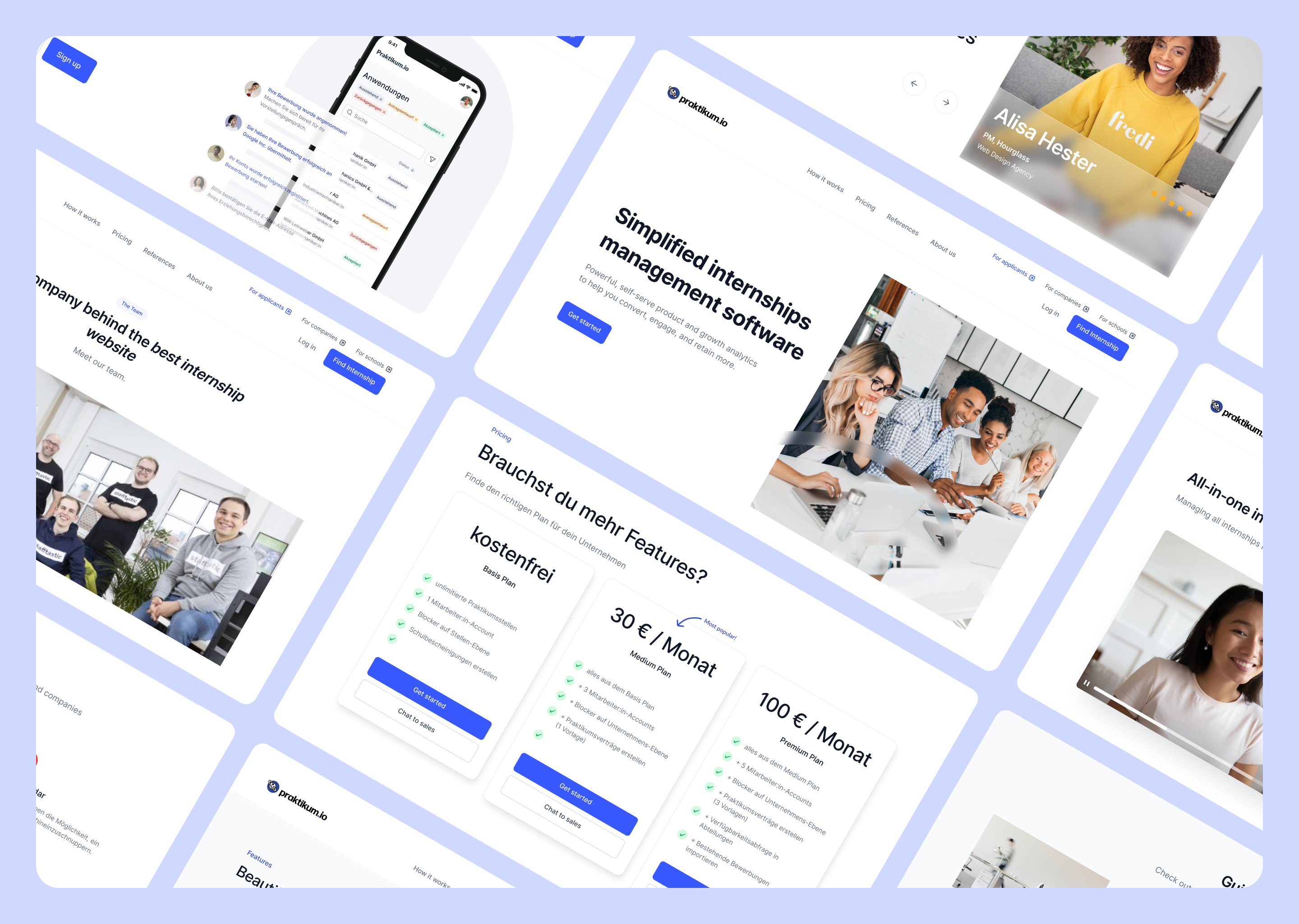
I've been working on this project while working at stafftastic in 2023-Now. I was fully responsible for leading the design efforts for designing the product, collaborating closely with a talented team of 10 software engineers, product managers, CMO, and CTO to develop the Praktikum.io Web App from the ground up.
I was fully responsible for leading the design efforts of Stafftastic, collaborating closely with a talented team of 10 software engineers, product managers, CMO, and CTO to develop the Praktikum.io Web App from the ground up.
Throughout the project, I was involved in every phase of the design and development process, starting with in-depth user research and culminating in a comprehensive visual redesign.
This case study will show the step-by-step approach we undertook, which helped us launch a full-featured product that received great press exposure and has the potential to become an industry leader in Germany's Interns Recruitment market.
Please note that, in adherence to my non-disclosure agreement, confidential information has been omitted in this case study. The provided information solely represents my own perspective and does not necessarily reflect the views of Stafftastic.
While Praktikumswoche was the government-funded automatic matching platform between applicants and companies, we recognized the opportunity to offer users an enhanced experience with a new platform. In response to the growing demand for more freedom and flexibility in the job-seeking landscape, our team decided to design and launch a new platform called Praktikum.io (PIO).
With PIO, our aim was to create a highly engaging and full-featured job-seeking platform that provided users with greater autonomy and choice. We understood the importance of empowering individuals to take control of their career paths, and PIO was designed to offer a wide range of features and opportunities beyond internships.
We also recognized the necessity of sustaining the platform's growth and delivering a sustainable business model. As a result, we decided to operate PIO as a profit-oriented platform, structured on a subscription basis. This approach allowed us to offer premium services and advanced features, ensuring a high-quality experience for our users.
The launch of Praktikum.io marked a significant milestone in our journey. It represented our commitment to reshaping the job-seeking market in Germany and offering a platform that embraced user autonomy and personalized recommendations.
With prior experience from the Praktikumswoche app, along with user research data and usability tests, we had a strong starting point when we began working on PIO. This valuable knowledge and insights provided us with a clear roadmap and direction for building the Praktikum.io app. We used this foundation to inform our design and development process, ensuring that PIO was built with a user-centric approach and catered to the evolving needs of our users.
Our main goals with this project were to:
Collaboration is the key that actually made the launch possible. By collaborating with our software engineers, we were able to tackle challenges effectively, even with limited resources.
Despite the constraints, we were able to achieve the desired goals faster by implementing a clear and effective management system that allowed us colalborate fast, solve problems and brainstorm quickly.
Throughout the project, we held regular meetings and brainstorming sessions to discuss ideas, review progress, and address any roadblocks. By collaborating closely with our team members, including product managers, CMO, and CTO, we achieved alignment in our goals and strategies. This alignment facilitated a cohesive approach, resulting in a successful redesign that addressed key pain points and boosted user satisfaction.
In the end, our collaborative efforts were reflected in the results we achieved. Keep reading to learn more about our results :)
My design process for this project had a clear structure, enabling me to navigate complexities and deliver a successful outcome. Beginning with thorough user research, I’ve gained valuable insights through surveys, in-depth interviews, and testing. Translating these findings into actionable designs, we iterated and refined with user feedback, collaborating closely with stakeholders to align on objectives.
Ultimately, this process allowed us to create a product that met user needs, aligned with business goals, and exceeded expectations.
As a starting point in designing PIO, I’ve conducted a number of interviews with team members and stakeholders to gather requirements and discuss the functional limitations that we need to take into account.
These interviews served as a valuable opportunity to gather insights, understand requirements, and align everyone's vision for the project. Here's how I approached and executed the internal interviews:
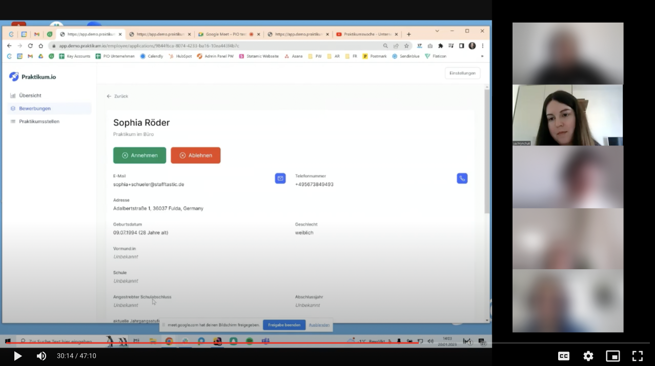
To start the user research, I’ve conducted interviews with stakeholders, in this case I’ve conducted interviews with 2 target groups: representatives of participating companies and with representatives of schools and organizations.
After the internal brainstorming, I’ve proposed to introduce a new feature: Praktikum Spaces. Basically, it is a feature that allows integrating the Internship Search Space directly to the School’s website. In this way, the schools will be able to easily help their students find internship while we will reach our business goal: attracting more users to our platform.
While interviewing companies that previously participated in Praktikumswoche, I’ve focused on finding answers to the following questions:
To find answers to these questions I’ve prepared a list of questions that might help stakeholders share their deeper concerns and share their experiences that might help me fully empathize with them and generate better design ideas.
While interviewing the schools and organizations, my main goal was to get insights on:
Talking about schools and organizations, they indicated that they assess the quality and impact of internships through various means, including student feedback, supervisor evaluations, and post-internship assessments, and the post-internship employment rate.
The primary goal and role of the schools in this process is to employ a very easy and quick solution to help their students get an internship, so I’ve draw a conclusion that we need to provide a very quick and straightforward way to do this, without having tech skills.
Finding the right users for the interviews was crucial, and we wanted to avoid relying on "professional users" who may respond based on their familiarity with user research. Instead, we collaborated with the marketing team to engage real users who were genuinely interested in improving the platform. We sent out personalized emails to all applicants, inviting them to participate in user interviews. The response was remarkable, with over 30 active users expressing their enthusiasm and willingness to contribute their valuable insights for free.
Our approach to conducting in-depth interviews for the new PIO platform was structured yet flexible, enabling us to extract valuable insights from applicants. Prior to the interviews, we defined clear research objectives and developed a comprehensive interview guide. This guide consisted of a thoughtful mix of open-ended and targeted questions tailored to the specific goals of the project. During the interviews, we created a comfortable and non-judgmental environment, encouraging participants to freely share their thoughts, needs, and pain points. By actively listening and carefully observing verbal and non-verbal cues, we captured nuanced details. Additionally, we utilized probing techniques to delve deeper into participants' responses, ensuring a comprehensive understanding of their experiences and perspectives.
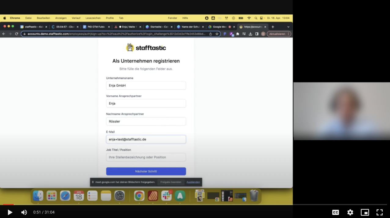
We’ve conducted in-depth interviews with 34 interns, that are currently using Praktikumswoche and would love to use Praktikum.io.
I employ various psychology tactics to gather rich insights from interviewees. One of the tactics I utilize is the "Curiosity Approach." By strategically displaying a genuine curiosity about the interviewee's experiences and perspectives, I create an environment where they feel valued and encouraged to share more openly.
Additionally, I leverage the "Reflective Listening" technique, actively demonstrating empathy and understanding through paraphrasing and summarizing their responses. This helps establish rapport and fosters a deeper level of engagement.
Another tactic I employ is the "Silence Technique." By strategically incorporating moments of silence during the interview, I encourage interviewees to fill the void with additional thoughts and insights.
Lastly, the "Neutral Stance" tactic involves consciously maintaining a neutral facial expression and body language. This approach creates a non-judgmental atmosphere, allowing interviewees to express themselves authentically without feeling influenced or biased.
Insight #1:
Transparent Application Status: Applicants expressed frustration with the lack of visibility into the status of their applications. They desired real-time updates and notifications to stay informed throughout the application process, reducing uncertainty and increasing engagement.
Insight #2:
Candidates would love to have more control over their internships. In particular, they’ve shown the desire to be able to select companies on their own, not just be matched with relevant companies.
Insight #3:
Users expressed a desire for personalized internship recommendations based on their skills, interests, and career goals. They emphasized the importance of receiving tailored suggestions to help them discover relevant opportunities more efficiently.
Insight #4:
Applicants emphasized the significance of comprehensive company profiles and authentic reviews from past interns. They desired detailed information about the company culture, work environment, and potential growth opportunities to make informed decisions when applying for internships.
To guide our ideation process, we adopted the "How Might We" approach, which allowed us to reframe problems as opportunities for creative solutions. By asking thought-provoking questions, we unlocked the team's creativity and fostered a collaborative environment to generate impactful ideas for the new features in the PIO app.
The main question we asked ourselves:
Through our use of the "How Might We" approach in the ideation process, we generated numerous ideas to tackle the critical challenges and opportunities for the PIO app. By diving deep into these questions, we set the groundwork for designing groundbreaking features that give users greater control, foster trust, enhance system visibility, and enable seamless adoption by schools.
We utilized the user story technique to define the features we would create for each user type. By analyzing user research data, we gained insights into their needs and challenges, enabling us to generate ideas that would make their lives easier. User stories served as a bridge, translating our HMW brainstorming ideas into concrete feature concepts that directly addressed specific user requirements. Additionally, this process led us to discover new feature ideas that would further enhance the user experience. By focusing on user stories, we ensured our design decisions were user-centric, resulting in a platform that caters to the unique needs of our users.
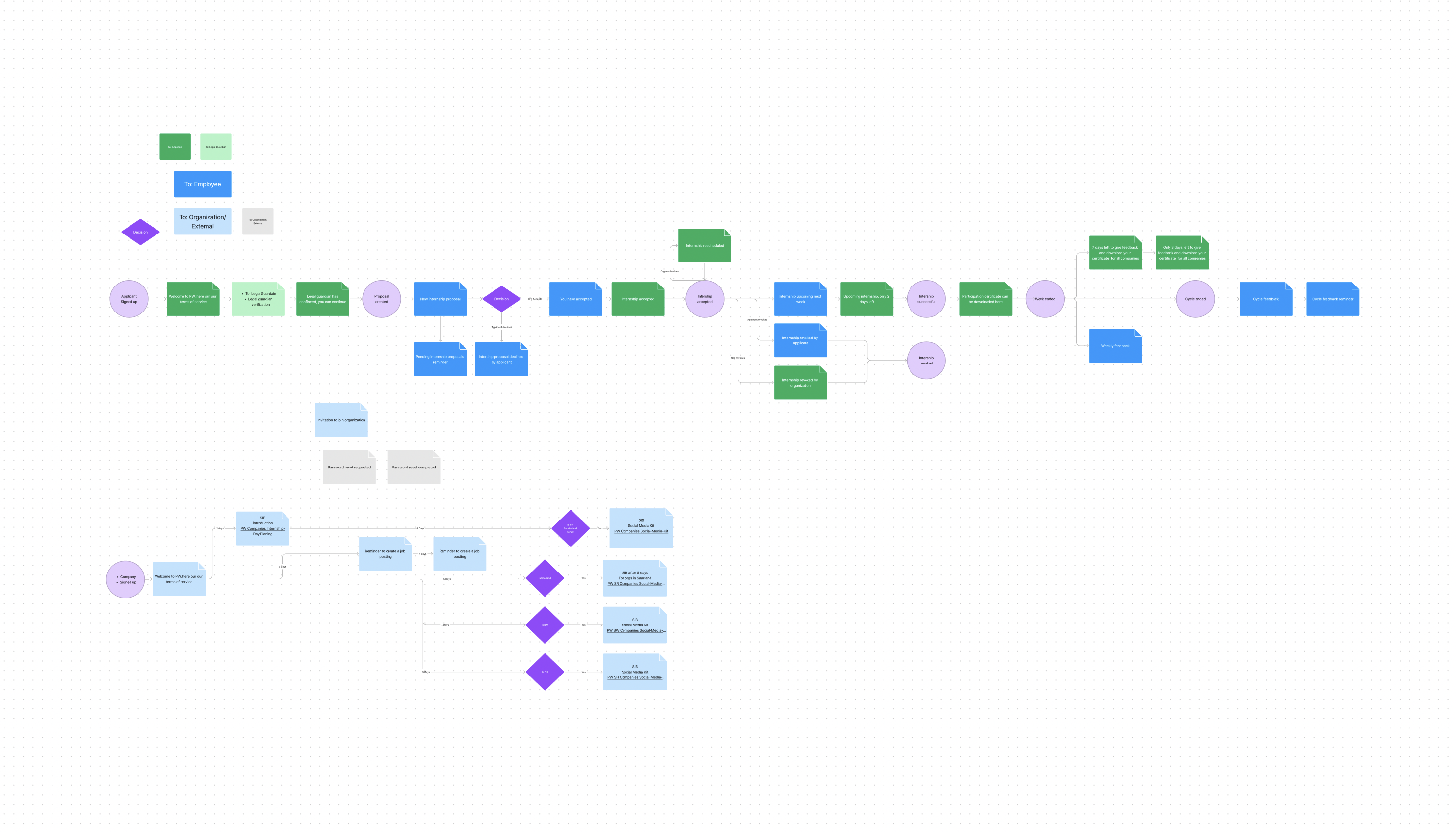
After defining the user stories, I proceeded to translate them into user flows, mapping out the journey and interactions that users would have within the Praktikum io.
This involved creating a clear structure of features and screens that would guide users through their desired actions and tasks. By visualizing the user flows, I gained a deeper understanding of the logical sequence of steps and the connections between different features.
Through this process, I also identified potential gaps and inconsistencies in the user experience and made necessary adjustments to ensure a seamless flow. So basically, in this project, user flows served as a blueprint for the design phase, providing a solid foundation for the creation of wireframes and prototypes.
Once the user flows were finalized, I began translating them into hand sketches to visualize the design structure. I created rough sketches of each screen, focusing on the key elements and layout. This allowed me to quickly iterate and refine the design ideas before moving on to digital tools.
Wireframes provided a flexible and efficient way to explore different layouts and arrangements, ensuring that the user interface would support the desired user journey. The hand sketches served as a solid foundation for further discussions and refinements, enabling us to fine-tune the visual representation of the app's features.
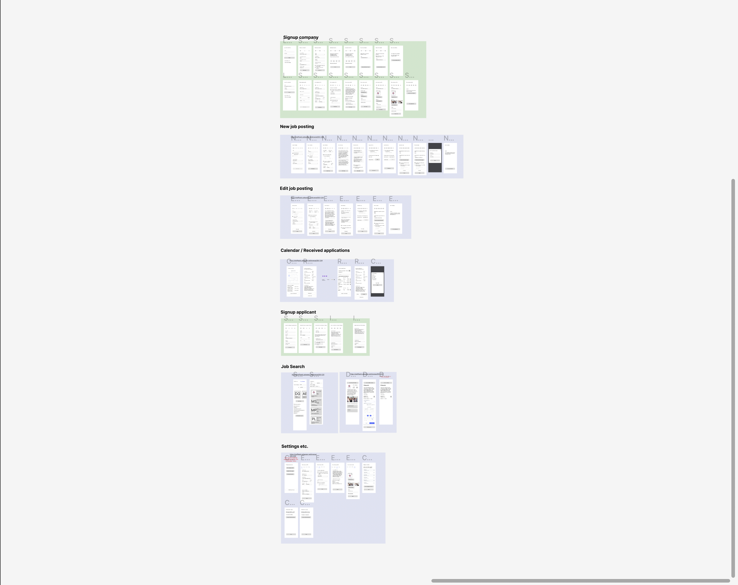
During this stage, which has taken almost a month, I’ve translated the hand sketches into aesthetic and functional Figma designs. At this stage, I’ve created a UI Kit and designed all necessary screens taking into account my UX knowledge and user research findings.
Finally, I’ve created a fully-functioning interactive prototype in Figma to start usability testing and validate our design solutions.
In preparation for usability testing, I conducted thorough quality checks to ensure the prototype was free of technical issues and inconsistencies. I organized the screens in a logical flow, ensuring smooth navigation and a coherent user journey. The fully-functioning prototype in Figma served as a valuable tool during usability testing, enabling participants to engage with the design, provide feedback, and uncover any usability challenges or areas for improvement. Their insights guided further design refinements and informed the next steps in the development process.
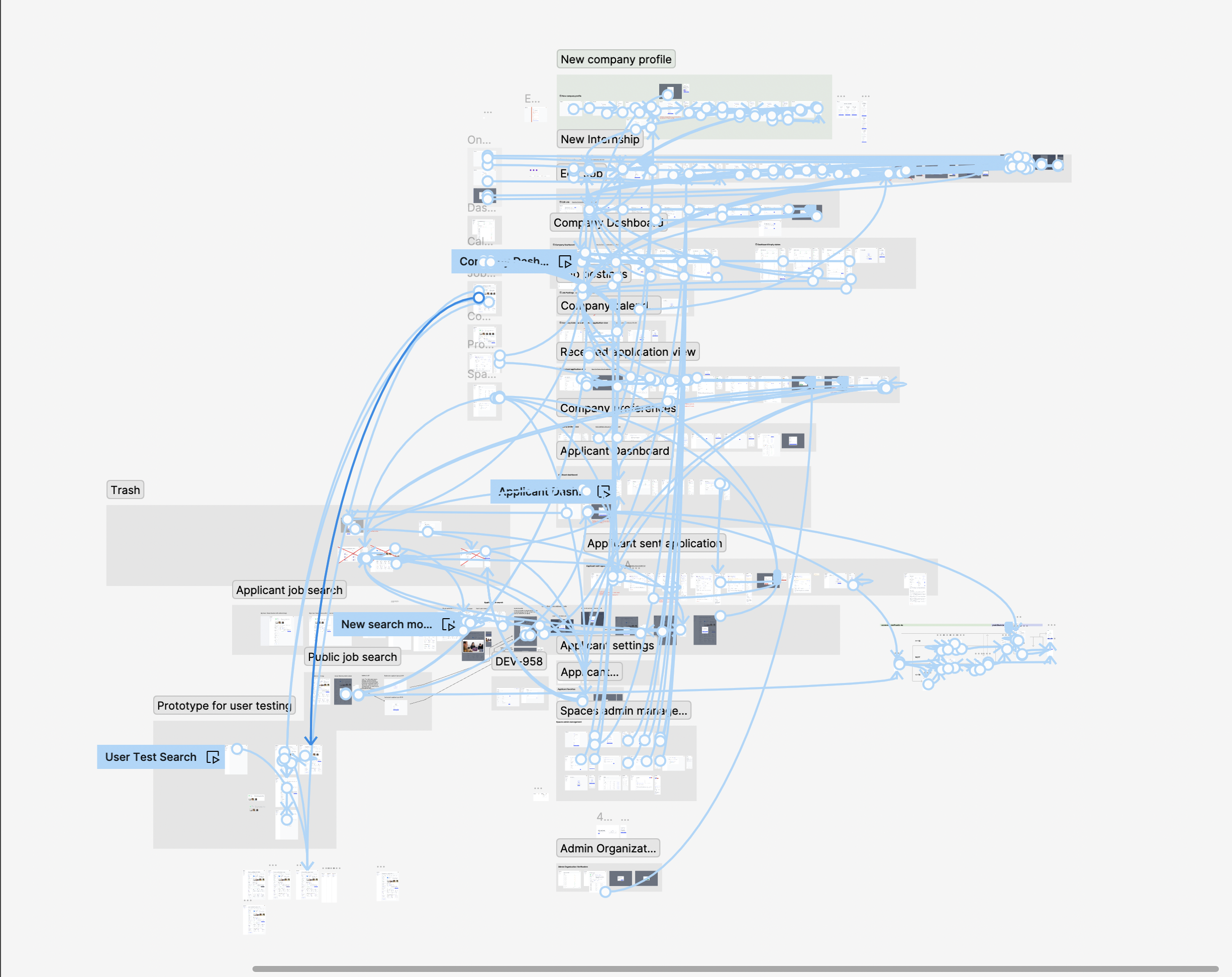
We conducted usability testing to gather valuable insights and assess the effectiveness of the design before the launch. A total of 15 participants, representing our target user demographic, took part in the testing sessions.
During the usability testing, we observed participants' interactions with the interactive prototype and collected their feedback through structured interviews and task-based scenarios. This allowed us to identify key usability issues and gather actionable insights to enhance the design.
Three main findings from the usability testing were:
To address these findings, I made several design improvements before the developer hadoff. I’ve refined the placement and visibility of the "Settings" button, ensuring it was more prominently displayed. Also, I enhanced the navigation flow to provide a clear and intuitive path back to the homepage. Additionally, I revised the application status indicators to make them more visually distinct and understandable.
Also, I’ve added several progress indicators to the proposal view, and added a progress bar showing application status to applicant, which significantly improved the experience for interns.
To create a user-centric and guided onboarding process while adhering to the principle of asking for as little information as possible, we employed a thoughtful and streamlined approach.
Rather than bombarding users with extensive forms and lengthy questionnaires, we strategically limited the amount of information we requested, prioritizing only the essential details necessary for immediate functionality.
By carefully considering the user journey, we aimed to strike a balance between obtaining the necessary information and respecting users' time and privacy. Additionally, we incorporated intuitive interfaces, tooltips, and contextual help to offer assistance and answer common questions throughout the onboarding process, ensuring a smooth and informative experience for our users.
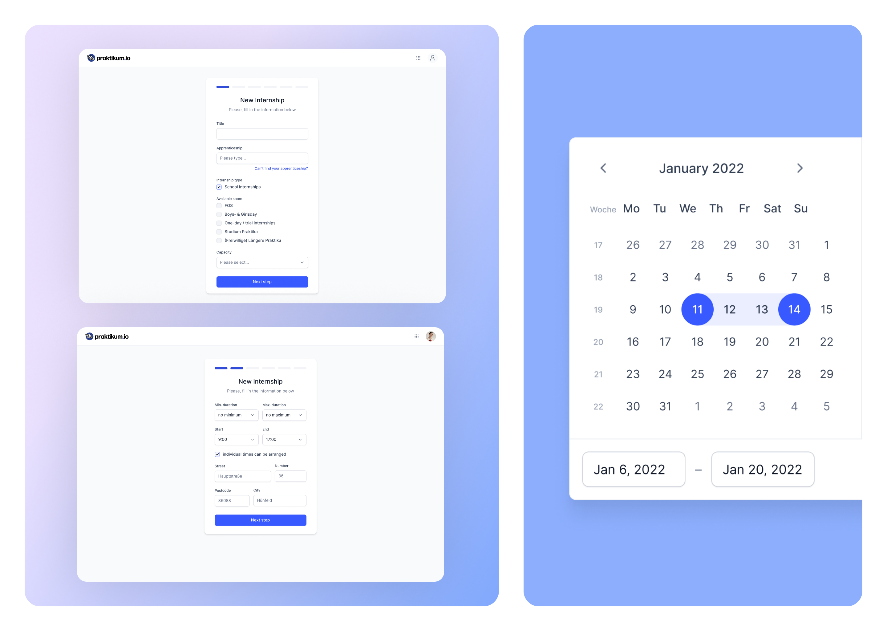
To address the problem of users feeling a lack of control, I divided the creation process into a short, multi-step form with clear progress indicators. This approach allowed users to track their progress and understand their position within the overall process.
By taking into account the "visibility of system status" heuristic, users gained a sense of control and were able to anticipate the steps ahead. Each step was designed to be concise and focused, presenting users with only the necessary information and options required at that stage.
Additionally, I ensured that error messages and validation checks were provided in real-time, giving users immediate feedback on any mistakes or missing information. By incorporating this user-centric approach, we aimed to empower users and alleviate any frustrations or uncertainties they might encounter during the internship creation process.
With the dashboard design, my goal was to make it straightforward and user-friendly, ensuring users had a clear overview of their progress on the platform. To achieve this, I used cards to display relevant internship stats, providing users with quick and concise information about their applications, accepted internships, and upcoming deadlines.
Additionally, I incorporated a table that centralized all the applications and internships in one place. The table had sortable columns, allowing users to easily organize and prioritize their entries based on factors like application status, start date, or company name. This simplified tracking and management of applications, providing users with a streamlined view of their opportunities.
To keep users informed, I implemented a notification system. Users received real-time updates and alerts for changes in application status, interview invitations, and other significant updates related to their internships. This feature eliminated the need for manual searching and ensured that users stayed up to date without any hassle.

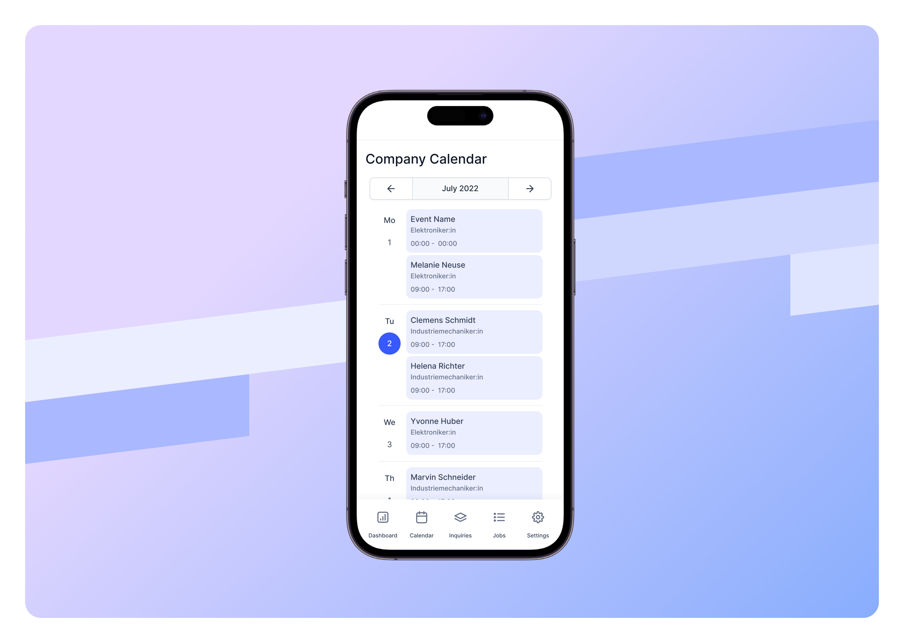
I created a calendar feature that allowed companies to track their internships on a daily, weekly, and monthly basis, while also providing them with the ability to easily manage and make changes to their internship schedules.
This enhancement significantly improved users' control over their internship processes. By being able to view and modify internship details in real-time, companies gained a greater sense of control and flexibility. They could conveniently edit, delete, or reschedule internships as needed, enabling them to adapt to evolving circumstances seamlessly.
This increased level of control and engagement not only improved the overall user experience but also fostered higher levels of company involvement and participation in the internship program.
That’s the design we’re particularly proud of :) I’ve designed an intuitive, aesthetic, and attractive design for the job search page, which made significant improvements to the overall job searching process.
One of the key elements I implemented was the use of cards to display all relevant data for each internship. These cards provided a visually appealing and organized presentation of internship details, including the company name, position, location, and application deadline.
This design allowed applicants to quickly scan and evaluate opportunities, making it easier to find relevant internships that aligned with their interests and qualifications. The use of cards not only enhanced the visual appeal of the search page but also improved the overall user experience by presenting information in a clear and digestible format.
The impact of this design improvement was confirmed by positive feedback from applicants who praised the intuitive and attractive nature of the search page. Applicants found it easier to navigate the search page, identify suitable internships, and make informed decisions about their applications.
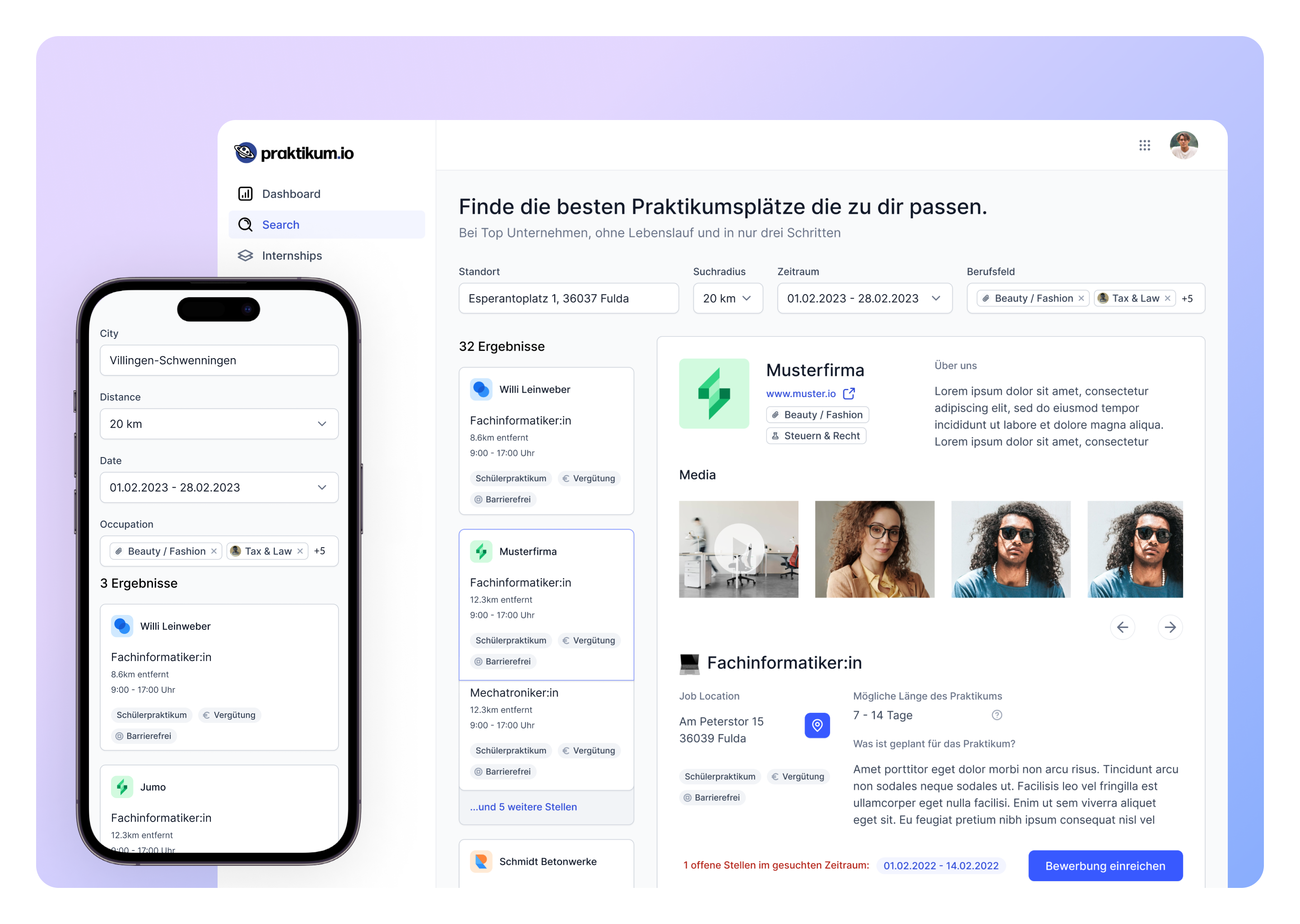
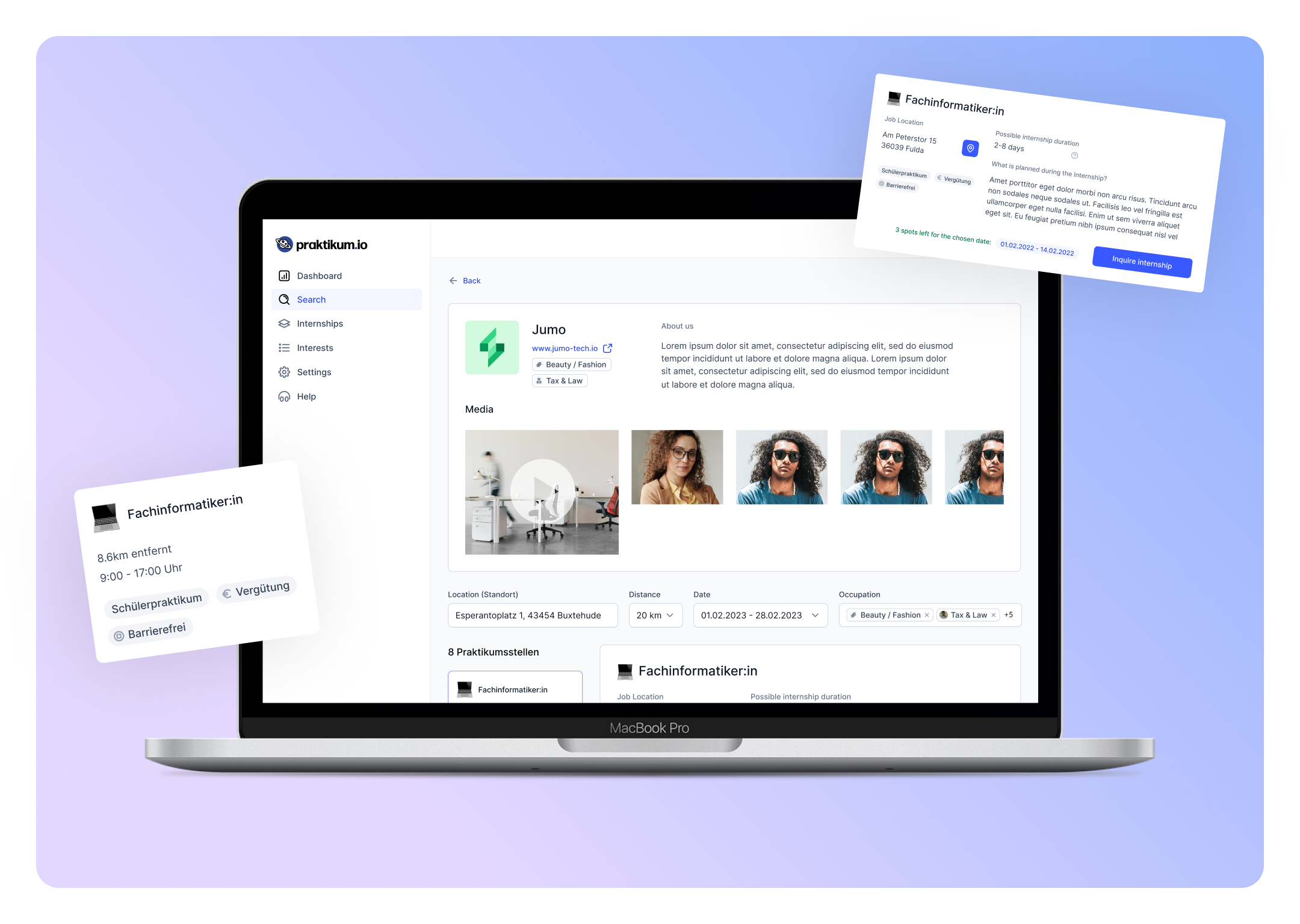
To address the main concerns of applicants regarding uncertainty and lack of motivation when considering an internship, I strategically redesigned the company profile page to enhance usability and establish trust.
A key element I incorporated was the use of media, including videos and photos, to provide a glimpse into the company's culture and vibes. By showcasing the work environment, team dynamics, and company events, applicants were able to get a visual representation of what it would be like to work at the company.
Also, I’ve added badges on the company profile page to indicate whether internships were paid or unpaid. This transparent labeling helped applicants make informed decisions by providing clear information about the financial aspect of the internships. The inclusion of badges for paid internships served as a motivating factor, as applicants were more likely to be interested in opportunities that offered compensation for their work.
To address companies' concerns about candidate qualifications, I designed a proposal (application) view that provided a solution. In particular, I’ve added some more relevant information as education, exerience, motivation letter and interests.
For applicants I’ve added a progress bar feature to ensure interns had a clear understanding of the current status of their application. This progress bar visually indicated the different stages of the application process, such as submission, review, interview, and final decision. By incorporating this element, interns could track their progress and have a sense of control over the application timeline.

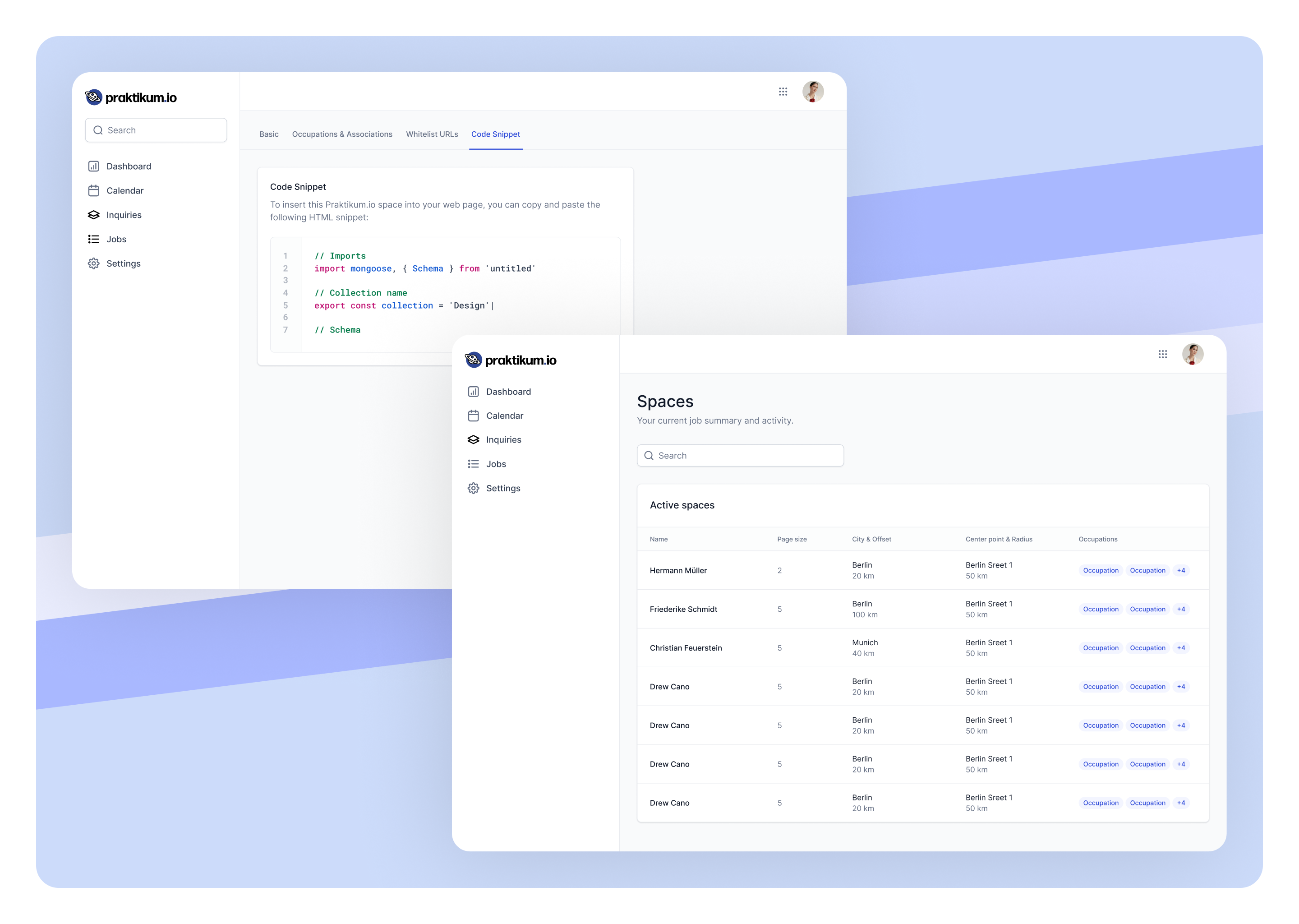
Talking about the schools interested in integrating our solution into their websites, I designed a feature called "Praktikum Spaces" within our platform. To facilitate this integration process, I designed a dedicated Spaces management screen within the PIO interface. This screen provided registered schools with a user-friendly interface to seamlessly integrate our internship search feature onto their company websites.
Through the Spaces management screen, schools could easily access and customize the integration settings. They had the flexibility to choose the layout, design elements, and search parameters that best suited their website's aesthetics and functionality. By providing this level of control, we ensured that schools could seamlessly integrate our search feature while maintaining a consistent user experience for their website visitors.
The Spaces management screen also included comprehensive documentation and support materials to guide schools through the integration process. This further facilitated the adoption of our solution, as schools could access resources that addressed common questions and concerns during the integration.
During the development and launch stage, I ensured a smooth transition by conducting a thorough developer handoff. I collaborated closely with the development team, providing them with detailed documentation, design assets, and clear specifications.
I also facilitated regular communication and feedback loops, allowing developers to seek clarification or provide updates throughout the development process.
To track the development progress and ensure quality control, I utilized Chromatic, which helped me to visually track and review UI component changes, identifying any visual or functional discrepancies. I actively participated in the review process, offering suggestions and collaborating with developers to address any issues or enhancements needed.
This approach allowed for effective collaboration between the design and development teams, promoting a seamless implementation of the project while enabling me to provide valuable input to enhance the final product.
The last, but not the lease, I’ve designed a website for PIO. I designed separate interfaces for applicants, companies, and spaces to ensure a seamless and intuitive user experience.
The website was designed to highlight the specific features and benefits relevant to applicants, companies, and schools. For applicants, the website emphasized the ease of searching for internships, submitting applications, and accessing valuable resources. Companies were presented with a focus on the benefits of listing internships and managing applications efficiently. Schools were provided with information on integrating the product's search feature into their websites to enhance the internship opportunities available to their students.
